IBM BPM
IBM BPM
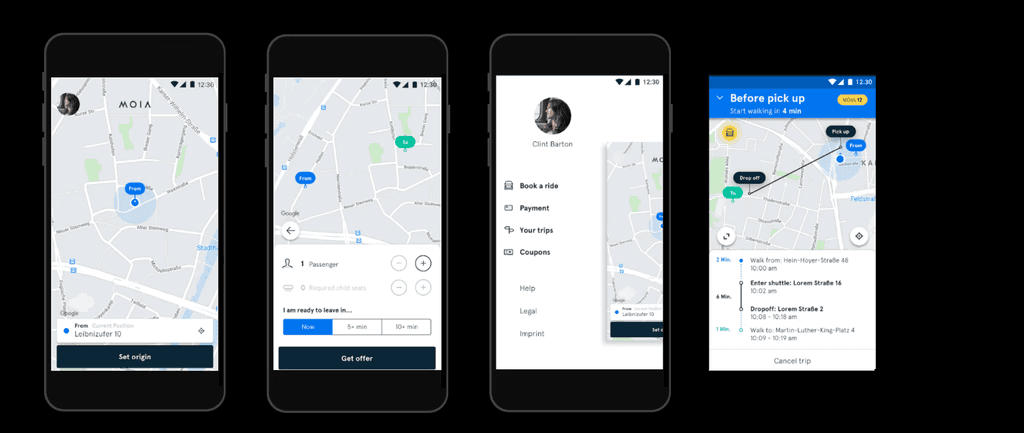
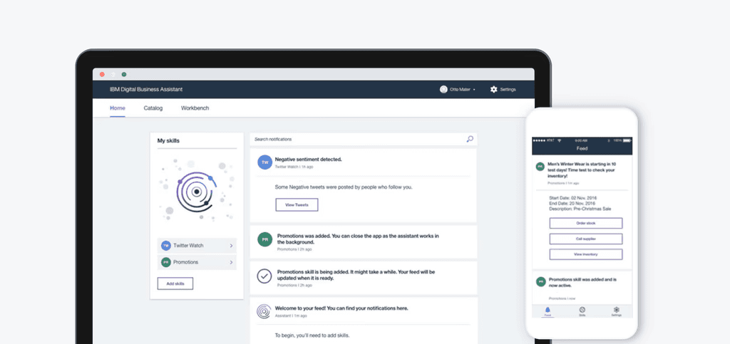
SaaS application
SaaS application
ROLE
UX Design • UI Design
ROLE
UX Design • UI Design
Get Started
Get Started
Overview
Overview
IBM BPM (Business Process Manager) is a Cloud services portfolio product that aims to optimize digital productivity.
I created the UI Style Guide to improve the overall UX of the SaaS application and mobile version.
My main role within the team was to
• improve the consistency of the UI by defining the guidelines
• extend the Design System
MY ROLE
UI design, UX design:
• UI Style Guide
• Extending the Design System
• Iconography
• Microinteractions
TEAM
2 UI Designers
1 UX Designer,
1 Front-End Developer
TIMELINE
4 months, 2019
TOOLS
Sketch, Jira
Problems
With an update from the old design to the new design, without a UI Style Guide, there was no scalable approach for maintaining and extending the Design System for this product.
There were no guidelines to support extending the product
Although a significant number of components were redesigned, there were no guidelines to support extending the product in a more scalable way.
There was still a mismatch between components, since some parts like the iconography was still in the old version.
Design & Development back & forth
Because of a lack of centralised documented reference point to guide implementation , there was too much Design & Development back & forth.
Opportunity
Ensure a cohesive & updated Product Design and User Experience in an easily accesible documentation for our team
Goals
When designing the solutions aspects such as the MVP goal, business requirements and user goals were considered
Document relevant design components
Information that does not form an essential or vital part can make UI Style Guides bloated and hard to work with. So narrowing down the core content for documenting was important but also challenging.
Organize components & and add context to design instructions
Context of use and guidelines for specifications were an important part to include for the UI components.
Make the UI Style Guide easily accessible for the Design & Dev teams
The living documentation was a piece that needed to be shared with the Design & Dev team on this project that also fits into the broader IBM Design System & Design Language.
Process
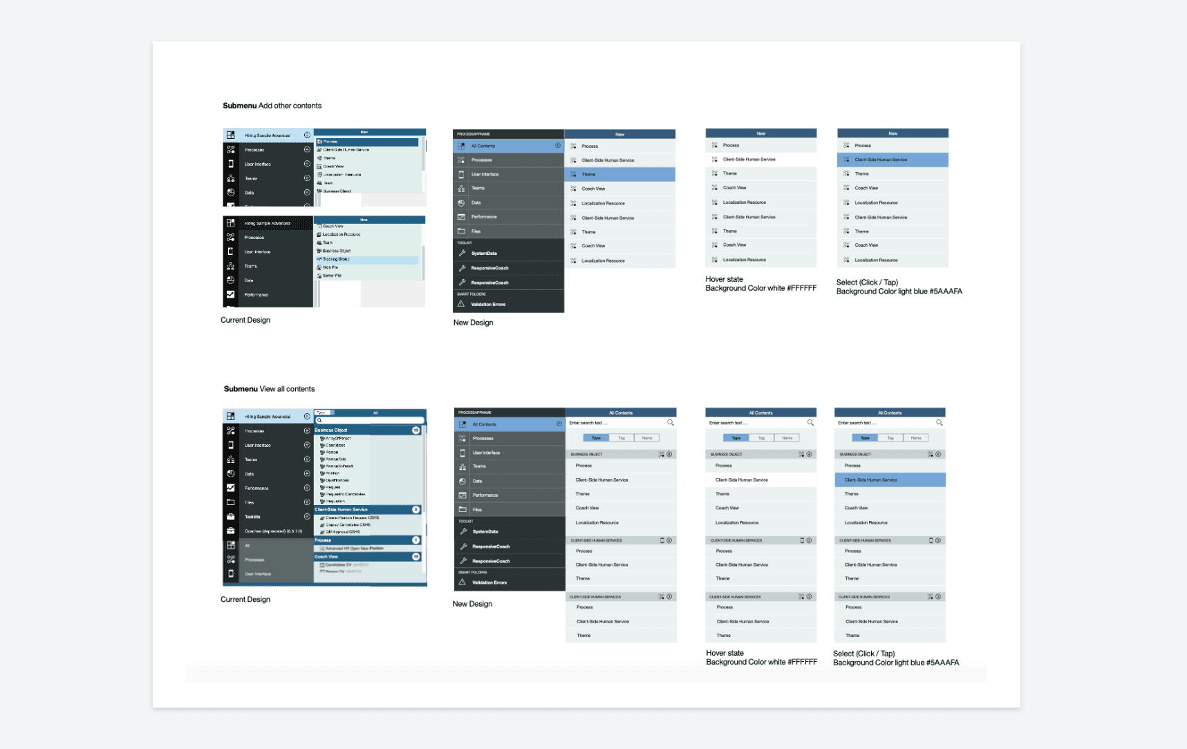
Auditing the main design components for the UI Style Guide
In approaching this project, it was important to make an audit of the different UI components involved. For this I broke the UI patterns into components and smaller pieces that constitute them. Similar to dismantling LEGO interlocking plastic bricks.
To understand the dynamics and hierarchy there were a couple of versions for defining the categories and taxonomies involved.

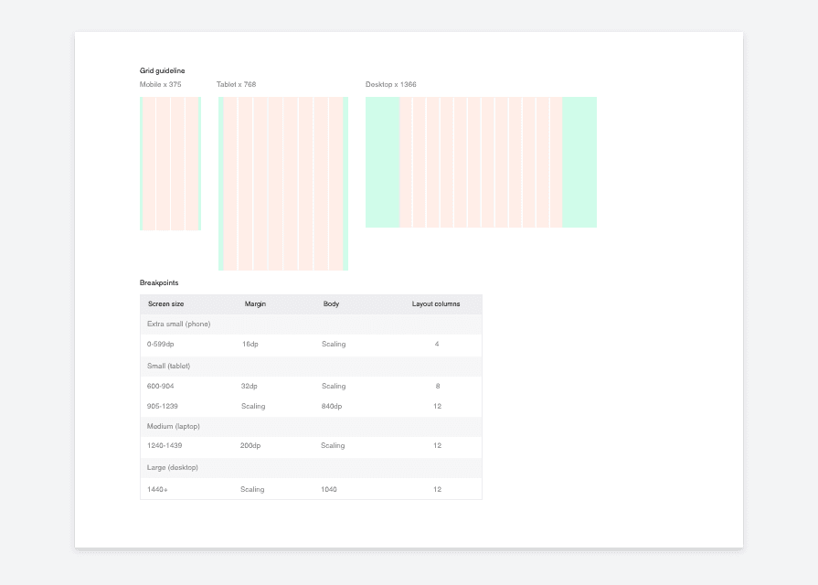
Responsive layout
I documented and helped define the overall responsive behaviour and how it adapts to all screen sizes and resolutions, from desktop to mobile and tablet. It was also important to realise that not every single element needs to be grid perfect. And that as grids are not hard and fast rules since they are there to help and guide.
Color palette
To avoid inconsistency in color use, I defined the color combinations. For this I listed the colors and their HEX values alongside specific pairings and use examples.
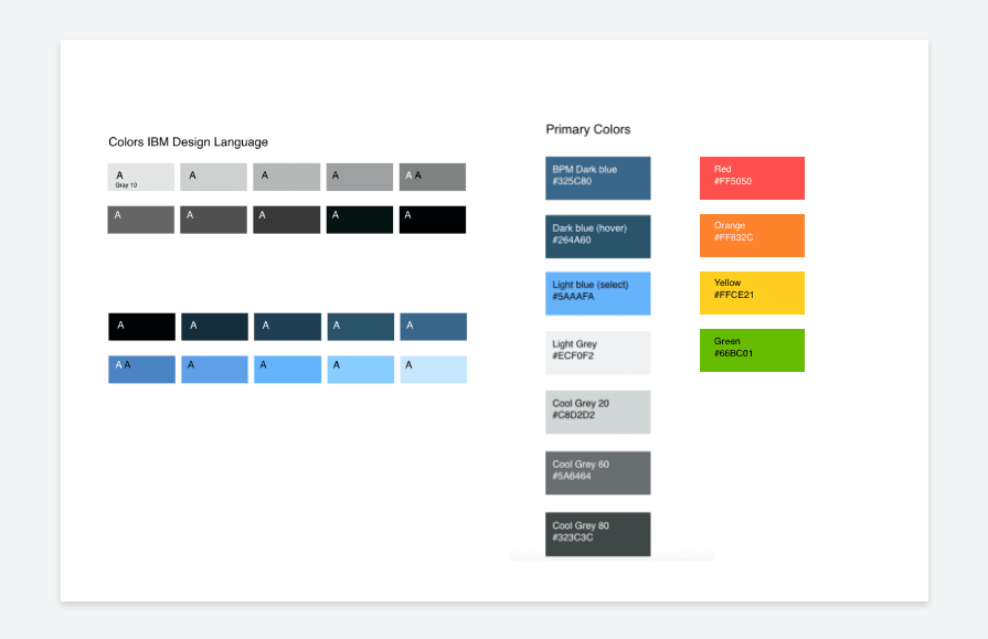
Additional UI components
To avoid inconsistency in color use, I defined the color combinations. For this I listed the colors and their HEX values alongside specific pairings and use examples.
Organizing and adding context for design instructions
Table of contents
The content for the UI Style Guide went through a couple of iterations. As aspects like hierarchy and the dynamics between components progressed so did the versioning and defining the categories and taxonomies involved.

Context notes
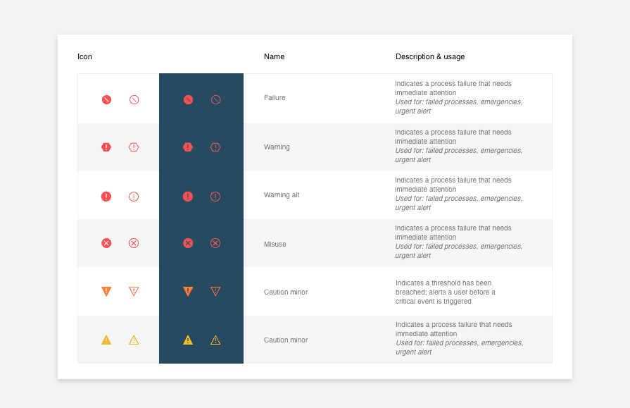
Context notes were included for describing when they should be used based on the urgency of communication.
These status indicators were used to show that immediate user action is required—in cases when, there is a problem with the system, something has malfunctioned, or a user must confirm a potentially harmful action. For example alerts, exceptions or confirmations.
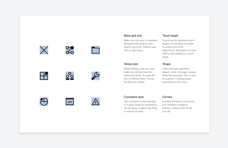
Iconography
Defining the core best practices for context of use was important. In this process I also defined the guideline for extending and building the iconography. Material Design was also used as a reference point.
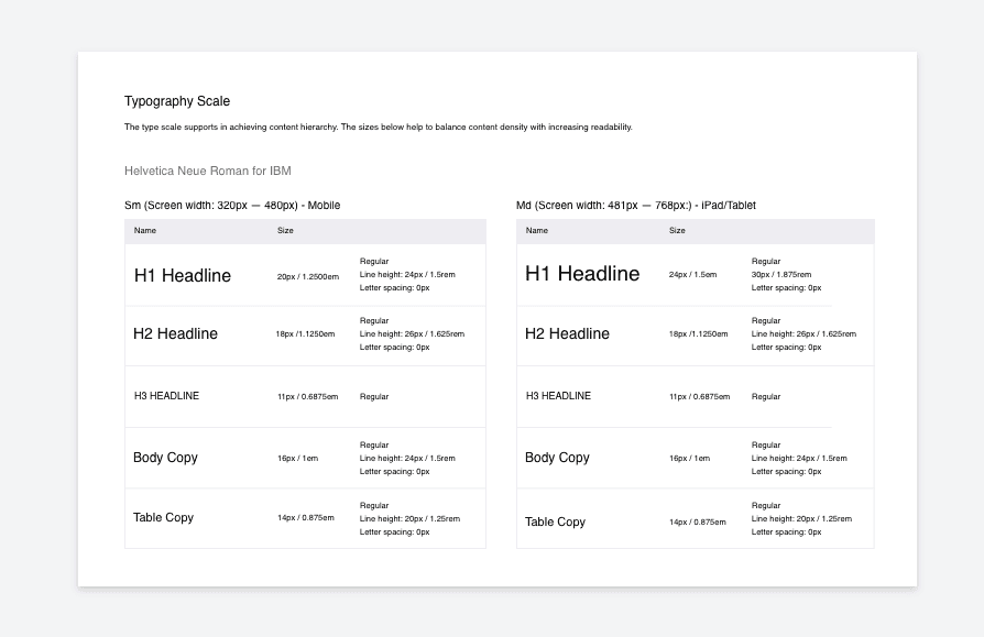
Typography scale
The typography was better clarified upon documentation and some of the typography duplicates in use was identified and discarded.
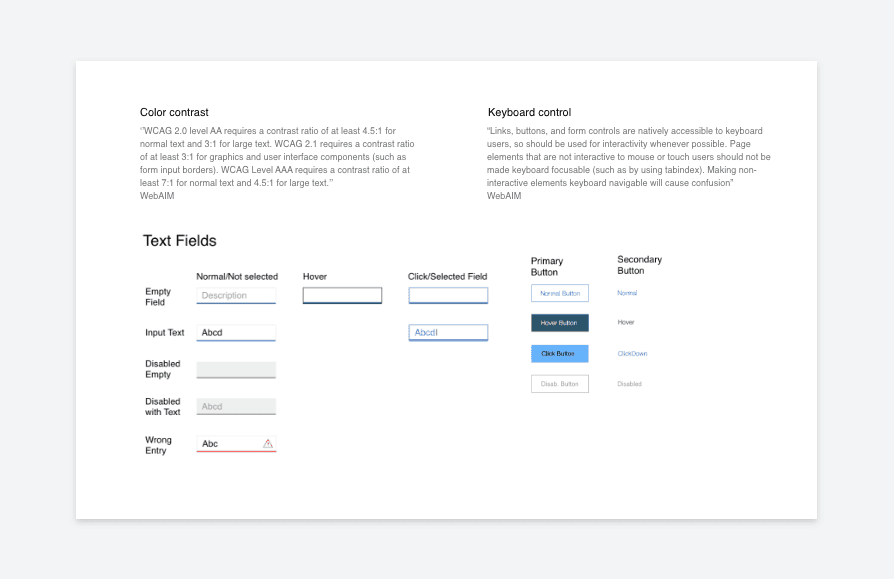
Acccesibility
I looked into designing for keyboard controlled users and aspects like colour contrast or font size. Background contrast is also a accessibility related aspect that was included.
Microinteractions
The team was working on a visual uplift for the BPM app alongside other projects in rotation. Although the BPM UI work did not have the highest priority, we still took time to evolve the UI through jam sessions and other meetings together with our development and paired managers for this project.
PROBLEM
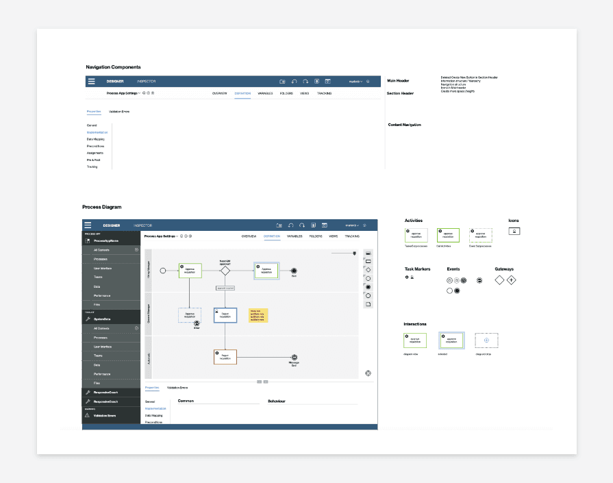
Hard to control connectors when creating process flows
In the process editor/designer area a developer can create different business processes. One of the uncovered pain points from our developers was the interaction when creating a new connected activity. The resulted diagram seemed untidy and the interaction for connecting activities was hard to control.

SOLUTION
Connector arrow is created automatically
When adding the follow up step the line is created automatically from the previous step to the new one.


Context notes
Context notes were included for describing when they should be used based on the urgency of communication.
These status indicators were used to show that immediate user action is required—in cases when, there is a problem with the system, something has malfunctioned, or a user must confirm a potentially harmful action. For example alerts, exceptions or confirmations.
Making the UI Styleguide easily accesible
Organisation in Confluence
Initially the documentation was spread across different files, from Ai files moved to Sketch files and into more consolidated versions of documentation in pdf files.
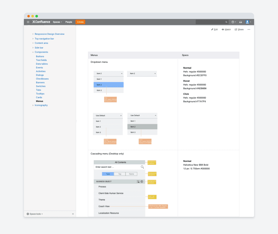
The solution for this challenge was to make the UI Style Guide accessible within the team from a centralised source. A good option at the time was using Confluence to store the documentation and guidelines.
Allowing for version history
The organisation in Confluence allowed for a more scalable approach to accommodate for version history and updates.
Problems
With an update from the old design to the new design, without a UI Style Guide, there was no scalable approach for maintaining and extending the Design System for this product.
Although a significant number of components were redesigned, there were no guidelines to support extending the product in a more scalable way.
There was still a mismatch between components, since some parts like the iconography was still in the old version.
There were no guidelines to support extending the product
Because of a lack of centralised documented reference point to guide implementation , there was too much Design & Development back & forth.
Design & Development back & forth
Goals
Information that does not form an essential or vital part can make UI Style Guides bloated and hard to work with. So narrowing down the core content for documenting was important but also challenging.
Document relevant design components
Context of use and guidelines for specifications were an important part to include for the UI components.
Organize components & and add context to design instructions
The living documentation was a piece that needed to be shared with the Design & Dev team on this project that also fits into the broader IBM Design System & Design Language.
Make the UI Style Guide easily accessible for the Design & Dev teams
When designing the solutions aspects such as the MVP goal, business requirements and user goals were considered
Opportunity
Ensure a cohesive & updated Product Design and User Experience in an easily accesible documentation for our team
Process
Auditing the main design components for the UI Style Guide
In approaching this project, it was important to make an audit of the different UI components involved. For this I broke the UI patterns into components and smaller pieces that constitute them. Similar to dismantling LEGO interlocking plastic bricks.
To understand the dynamics and hierarchy there were a couple of versions for defining the categories and taxonomies involved.
Responsive layout
I documented and helped define the overall responsive behaviour and how it adapts to all screen sizes and resolutions, from desktop to mobile and tablet. It was also important to realise that not every single element needs to be grid perfect. And that as grids are not hard and fast rules since they are there to help and guide.
Color palette
To avoid inconsistency in color use, I defined the color combinations. For this I listed the colors and their HEX values alongside specific pairings and use examples.
Additional UI components
To avoid inconsistency in color use, I defined the color combinations. For this I listed the colors and their HEX values alongside specific pairings and use examples.
Microinteractions
The team was working on a visual uplift for the BPM app alongside other projects in rotation. Although the BPM UI work did not have the highest priority, we still took time to evolve the UI through jam sessions and other meetings together with our development and paired managers for this project.
PROBLEM
Hard to control connectors when creating process flows
In the process editor/designer area a developer can create different business processes. One of the uncovered pain points from our developers was the interaction when creating a new connected activity. The resulted diagram seemed untidy and the interaction for connecting activities was hard to control.
SOLUTION
Connector arrow is created automatically
When adding the follow up step the line is created automatically from the previous step to the new one.
Context notes
Context notes were included for describing when they should be used based on the urgency of communication.
These status indicators were used to show that immediate user action is required—in cases when, there is a problem with the system, something has malfunctioned, or a user must confirm a potentially harmful action. For example alerts, exceptions or confirmations.
Making the UI Styleguide easily accesible
Organisation in Confluence
Initially the documentation was spread across different files, from Ai files moved to Sketch files and into more consolidated versions of documentation in pdf files.
The solution for this challenge was to make the UI Style Guide accessible within the team from a centralised source. A good option at the time was using Confluence to store the documentation and guidelines.
Allowing for version history
The organisation in Confluence allowed for a more scalable approach to accommodate for version history and updates.
MORE PROJECTS