
DocMe
DocMe
Health app - mobile iOS, Android + SaaS
Health app - mobile iOS, Android + SaaS
UX Design • UI Design • Design System
UX Design • UI Design • Design System
Get Started
Get Started
Overview
Overview
DocMe is a health app that reads your vital signs from a selfie.
For its launch in the UK, I have worked as a Lead Product Designer to deliver the mobile (Android + iOS) and SaaS versions.
DocMe is a health app that reads your vital signs from a selfie.
For its launch in the UK, I have worked as a Lead Product Designer to deliver the mobile (Android + iOS) and SaaS versions.
MY ROLE
Lead Product Designer
TEAM
Management team (founder team), Development team (5 developers), Computer Vision team (5 engineers), Marketing team (2 marketing managers)
TIMELINE
1 year, 2021
TOOLS
Adobe Xd, Jira, Figma, Miro, Notion
SKILLS I APPLIED
• iOS, Android - UI Design for cross platform native apps & responsive SaaS application
• MVP feature prioritisation
• Atomic design approach in Design Systems
• Development hand-off & collaboration
• User testing - preference test
• Using user research to drive design decisions
• Agile collaboration environment
• Product management
SUCCESS METRICS
• Improved user registrations
• Improve app store ratings - for Apple App & Google Play Store
4,7/5
Apple App Store &
Google Play Store
prev.4.6
from 0 to
Ca 400
Registrations
3 Accelerators
Cambridge Judge Business School - Accelerate Cambridge - UK, Panacea Accelerator - UK, Newchip Accelerator - U.S.
2 LOIs
B2B agreements for the SDK solution from Health Insurance & Fitness Tech companies
Due to the market pull from the B2B end from interested companies, DocMe changed the focus from B2C to the SDK solution within its first year.
SUCCESS METRICS
• Improved user registrations
• Improve app store ratings - for Apple App & Google Play Store
4,7/5
Apple App Store &
Google Play Store
prev.4.6
Registrations
from 0 to
Ca 400
Cambridge Judge Business School - Accelerate Cambridge - UK, Panacea Accelerator - UK, Newchip Accelerator - U.S.
3 Accelerators
2 LOIs
B2B agreements for the SDK solution from Health Insurance & Fitness Tech companies
Due to the market pull from the B2B end from interested companies, DocMe changed the focus from B2C to the SDK solution within its first year.

Competitive analysis
Competitive analysis
We considered the UK market main competitors such as Binah.ai and Lifelight which were relevant for the go-to-market strategy.
However, for UX analysis and feature comparison on the B2C route we looked into Google's solution for the Google Pixel phone and apps such as Apple Health.
Google Fit
- Vital signs solution
Google Fit
- Vital signs solution
For reference - the current released version from Google Fit for Respiratory Rate.
Problems
We gathered research data to validate the need for recording vital signs. We tried to understand how doctors and people might use vital signs health data. Below are the main problems uncovered.
Seeing patients face-to-face presents an additional risk
Needing to see patients face to face in pandemic times puts both the health staff and patients at risk
Patient historical data is essential but can be difficult to obtain
To make informed decisions for patients the historical data of their vital signs is essential.
Hard time to understand health or wellbeing overview in most apps
Most users of existing health apps believe that it is hard to get an optimal health analysis when it comes to understanding vital signs values.
Opportunity
How might we better support an inexpensive solution for health-conscious young adults to take care of their health & wellbeing and to communicate their health information with their doctor remotely?
Goals
The DocMe Personal mobile version & DocMe Doctors SaaS version must achieve these main goals to be considered successful.
Launch
Build the mobile and desktop versions for personal use and doctors use. The approach is to ship a baseline functionality to build, test and ship within 6 months to learn from and improve on.
Build trust
Health Tech is a highly regulated area. For the launch in the UK on the Doctors platform it was important to integrate regulatory guidelines. We worked and tested using the NHS sandpit environment and provided NHS login. For the Personal use, we obtained the UKCA mark and offered user transparency regarding data and tech aspects.
Grow
To reach product-market fit in a within the UK within 12 months for both personal use and patients before growing to other regions.
On the Personal app side, we targeted Cambridge Colleges and for the Doctors side, we approached other HealthTech startups.
Constraints
Between tech, resources and business goals
Small Design, Dev, Computer Vision teams
With a Design Team of 2 (at its biggest), and small Tech Teams
of 15 people:
- we had to be intentional
when prioritising features &
- making incremental changes.
Technical considerations
For the core feature, and beyond
- there were clear dependencies that reflected in the UI
- and interaction design approach
Designing for trust, engagement & adoption
The product and business goals served as a guiding factor
- when prioritising features and updates.
DocMe Personal
DocMe Personal
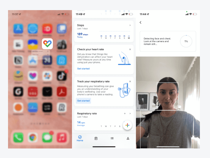
Measure your vital signs
Measure your vital signs
PROBLEM
Users need to be guided to take their vital signs correctly
Issues
• Circle + a more obvious timer with a 15 s countdown - users were focusing on the timer without using the circle correctly to position their face for image capture
• Analyzing system feedback / loader
• Overview of analyzed vital signs
- these added unnecessary clutter to the experience and were not guiding the user efficiently
SOLUTION
Design a face mask UI so that the user knows where to exactly place their face.
I integrated a countdown in the form of a loader for a more seamless experience, for which user feedback was positively expressed from users as being a more 'sticky experience'.
Problems resolved
• Visibility of system status - non intrusive - seamless
• Correct positioning of the face through the face mask UI
• Timer + face positioning are combined in one solution with 2 states (1 for face positioning and the other for countdown)
• User is guided in 4 steps through a slider to ensure that the image recording is taken properly and in line with digital medical device compliancy - rather than having a separate slideshow for this information
-he is guided as he is taking the photo and not in a separate step
IMPACT
• Increased user engagement based on qualitative feedback and increased number of times per user using the feature
• Digital Medical device compliant (ORCHA Guidelines) and UKCA compliancy
• Increased user engagement based on qualitative feedback and increased number of times per user using the feature
• Digital Medical device compliant (ORCHA Guidelines) and UKCA compliancy

THINGS I WOULD HAVE DONE DIFFERENTLY
• More contextual guidance for image processing in real time with suggestions for light adjustment, not wearing glasses or a hat
• However we worked incrementally and the Computer Vision technological effort was too high to implement this in just one launch
• More contextual guidance for image processing in real time with suggestions for light adjustment, not wearing glasses or a hat
• However we worked incrementally and the Computer Vision technological effort was too high to implement this in just one launch
DocMe Doctors
DocMe Doctors
Receiving vital signs
Receiving vital signs
PROBLEM
PROBLEM
Seeing patients face to face to get their vital signs presents an additional risk
• More contextual guidance for image processing in real time with suggestions for light adjustment, not wearing glasses or a hat
• However we worked incrementally and the Computer Vision technological effort was too high to implement this in just one launch
SOLUTION
SOLUTION
Vital signs recording and sending
Vital signs recording and sending
Users needed to be able to take their vital signs, and share it with their doctors.
Users needed to be able to take their vital signs, and share it with their doctors.
Initial exploration
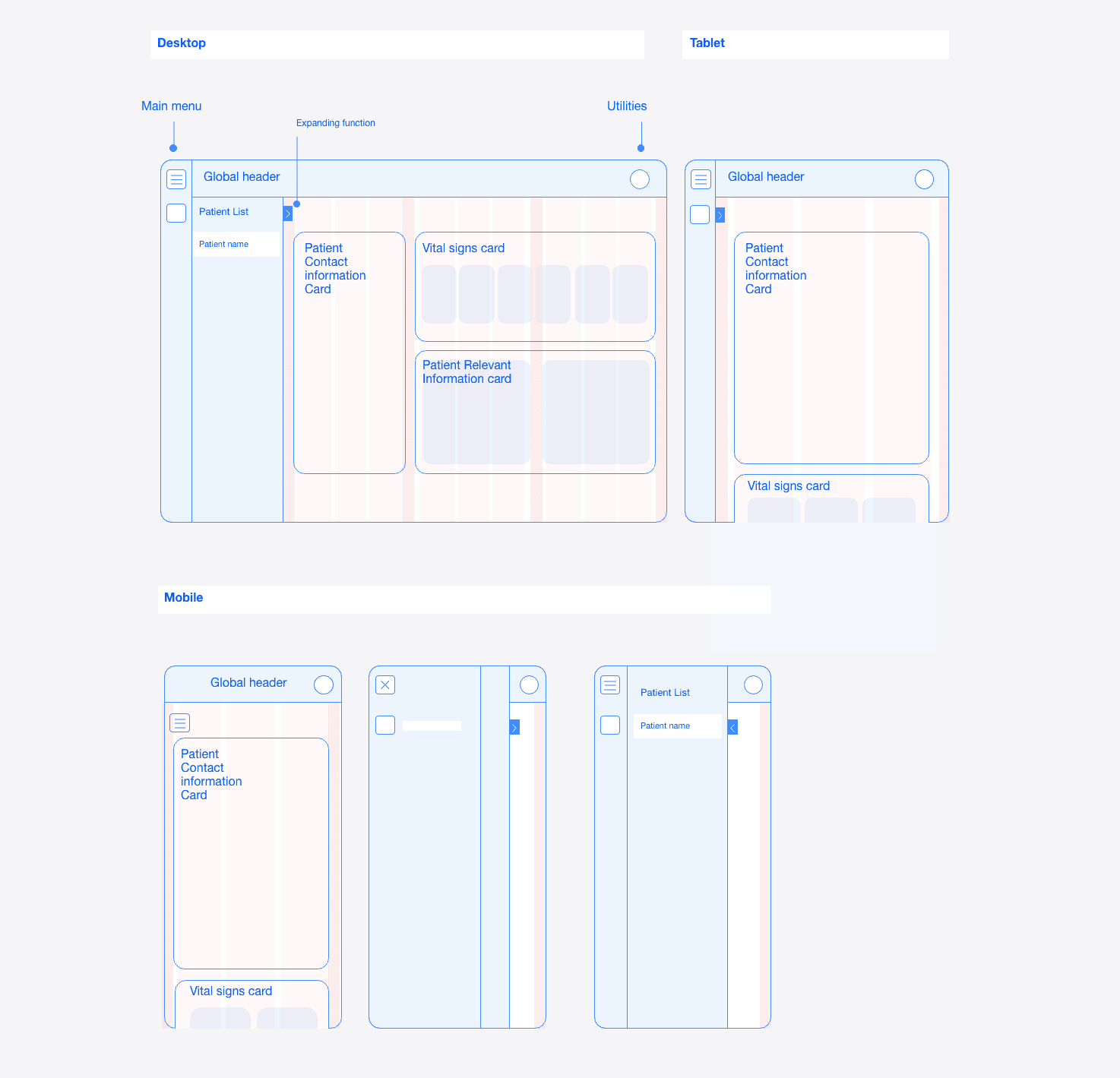
This app started from scratch. So my initial wireframes broke up the the core functionality and structured it within a responsive UI patterns approach needed for the SaaS platform. After getting user feedback for the wireframes from the doctors end we also validated the need for a doctor's patients list - as a core feature. As the designs got more validated I created the tickets for the UI components and core functionality.
This app started from scratch. So my initial wireframes broke up the the core functionality and structured it within a responsive UI patterns approach needed for the SaaS platform. After getting user feedback for the wireframes from the doctors end we also validated the need for a doctor's patients list - as a core feature. As the designs got more validated I created the tickets for the UI components and core functionality.

Iteration
To get clarity on what should be designed first we also worked with an effort / user impact priority matrix.
This helped to realize that in order to implement the requesting vital signs feature we had a dependency on having the doctor's patients list designed first.
In the user flow this enables doctors to add and store patients in order to request their vital signs data.
DocMe Personal
DocMe Personal
Onboarding & Signup
Onboarding & Signup
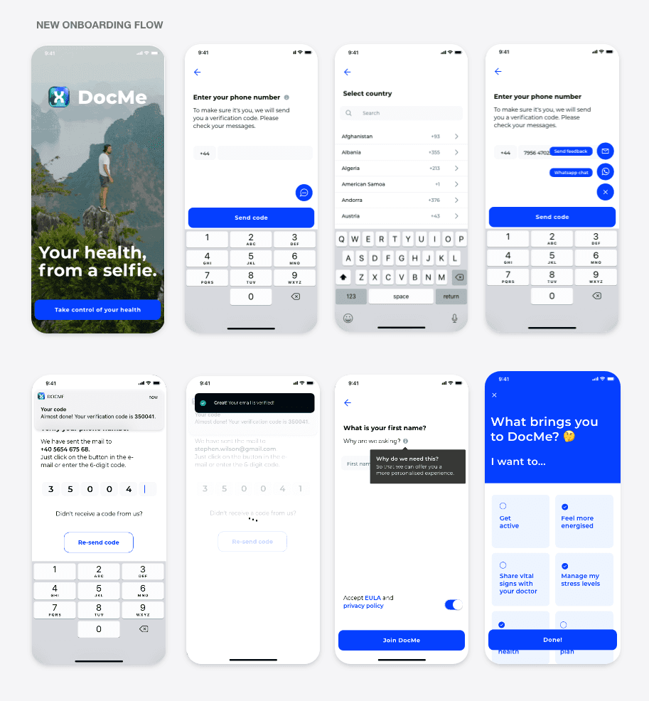
PROBLEM
Users need a way to signup fast and secure to try and use the app
This app started from scratch. So my initial wireframes broke up the the core functionality and structured it within a responsive UI patterns approach needed for the SaaS platform. After getting user feedback for the wireframes from the doctors end we also validated the need for a doctor's patients list - as a core feature. As the designs got more validated I created the tickets for the UI components and core functionality.
This app started from scratch. So my initial wireframes broke up the the core functionality and structured it within a responsive UI patterns approach needed for the SaaS platform. After getting user feedback for the wireframes from the doctors end we also validated the need for a doctor's patients list - as a core feature. As the designs got more validated I created the tickets for the UI components and core functionality.
OTHER SOLUTIONS CONSIDERED
However, as the stakeholder team realized that for the app to offer a personalized experience other use cases such as 'Add your doctor' were introduced in the signup flow.
However, as the stakeholder team realized that for the app to offer a personalized experience other use cases such as 'Add your doctor' were introduced in the signup flow.
SOLUTION
Design a face mask UI so that the user knows where to exactly place their face.
To tackle this I worked with the team to create a common understanding regarding a quick, easy and compliant onboarding experience experience that sticks to a functional MVP approach.
With the option to introduce the specific user data such as 'such as 'Add your doctor' - at a later stage in the app.
IMPACT
Design a face mask UI so that the user knows where to exactly place their face.
Creating a faster and easier signup
increased onboarding rates
Creating a faster and easier signup
increased onboarding rates

PROBLEM
Being at the risk of getting slammed with negative reviews
Launching the DocMe Personal app in the app stores meant that we could be at the risk of getting slammed with negative reviews, which would harm our SEO value and ranking in the app stores.
Launching the DocMe Personal app in the app stores meant that we could be at the risk of getting slammed with negative reviews, which would harm our SEO value and ranking in the app stores.
OTHER SOLUTIONS CONSIDERED
Initially the option for sending user feedback within the app was located under the Profile area. However this solution was more hidden and did not
had the same visibility at every step of the app use.
Initially the option for sending user feedback within the app was located under the Profile area. However this solution was more hidden and did not
had the same visibility at every step of the app use.
SOLUTION
Floating feedback button
By providing an outlet for the users to express frustration through the feedback button throughout the app directly rather than through the App Store we mitigated the risk of damaging our App store SEO.
And at the same time it served to reduce potential bugs and capture the pain points of users.
By providing an outlet for the users to express frustration through the feedback button throughout the app directly rather than through the App Store we mitigated the risk of damaging our App store SEO.
And at the same time it served to reduce potential bugs and capture the pain points of users.
IMPACT
Improved our app reviews in the App Store and provided essential data to reduce bugs and improve the app
Improved our app reviews in the App Store and provided essential data to reduce bugs and improve the app
PROBLEM
New users need to be introduced to core functionality to take full advantage of the app
After the signup process we observed through our Analytics data that users would explore the 'Vital signs' function, go through taking their vital signs. However they would not finish completing their profile or setup their PIN to secure their account.
After the signup process we observed through our Analytics data that users would explore the 'Vital signs' function, go through taking their vital signs. However they would not finish completing their profile or setup their PIN to secure their account.
OTHER SOLUTIONS CONSIDERED
Guided tour of the user interface (UI) with a mesh approach - this offered a more contextual approach. But less overview on all the tasks that needed to be explored and completed.
Guided tour of the user interface (UI) with a mesh approach - this offered a more contextual approach. But less overview on all the tasks that needed to be explored and completed.
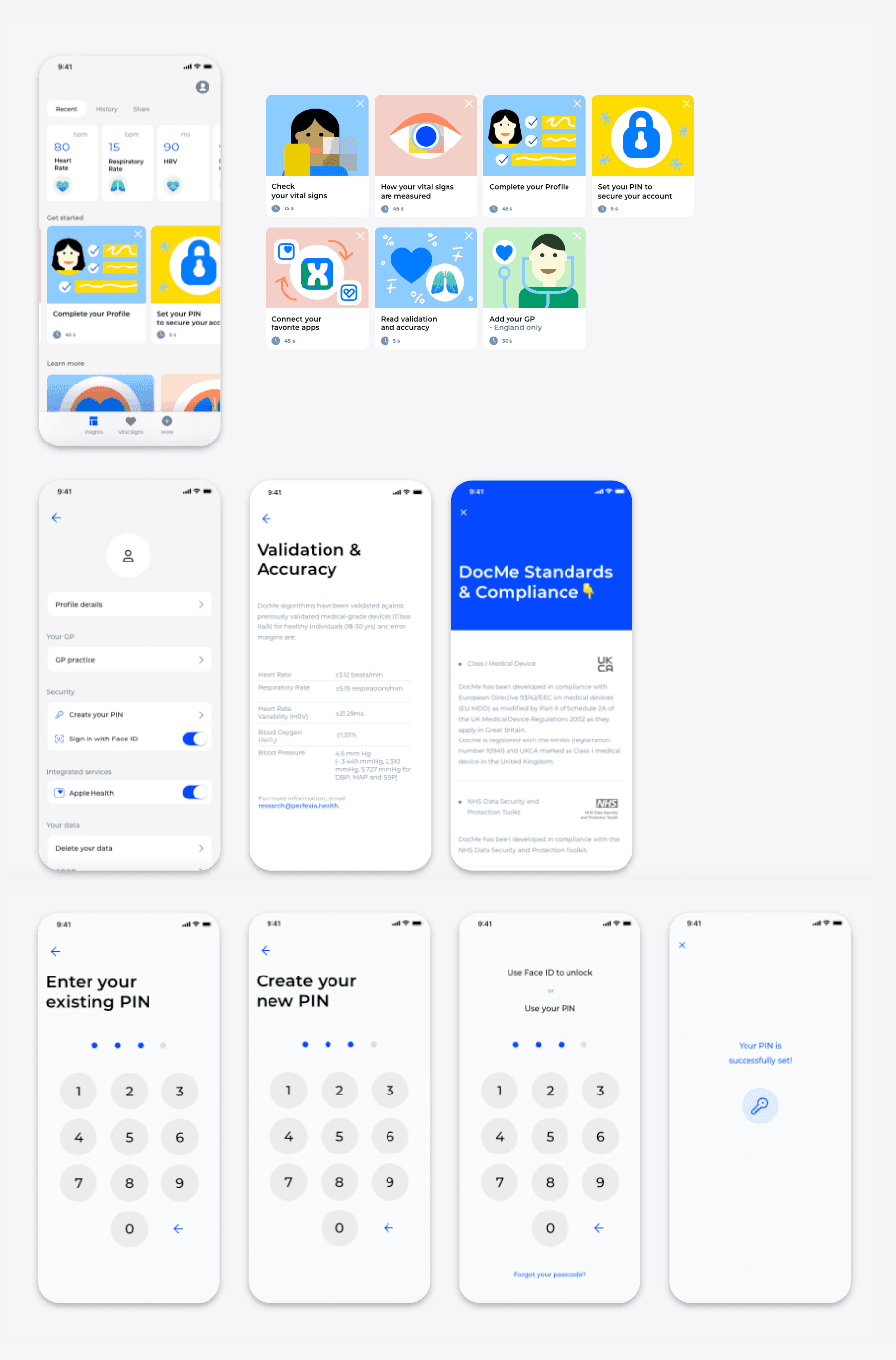
SOLUTION
Guiding new users through the app to get started
The 'Get Started' area introduced in the 'Dashboard' essential tasks such as:
• check your vital signs
• how your vital signs are measured
• complete your profile
• PIN setup to secure the account
• Connecting Apple Health and Google Fit apps
• Validation & accuracy information
• Add your GP (available for UK only)
IMPACT
• Improved the app user retention by engaging the user in exploring more of the app functionality
• Addressed transparency and trust issues by:
- detailing how the vital signs are measured by leveraging computer vision technology
- providing the validation & accuracy information from existent clinical trial data
DocMe Personal
DocMe Personal
Vital signs history & sharing functionality
Vital signs history & sharing functionality
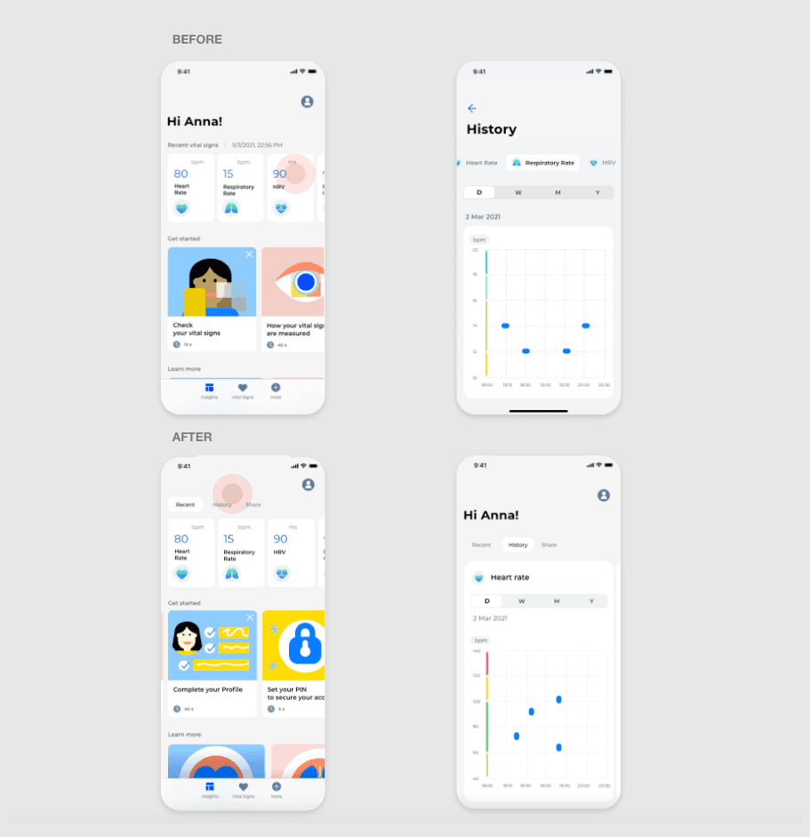
PROBLEM
Users need an overview of their vital signs data to be able to spot health pattern and communicate this information to their doctor
In order to take full advantage of the vital signs recording, the data needs to be recorded and stored continuously.
In order to take full advantage of the vital signs recording, the data needs to be recorded and stored continuously.
SOLUTION
Historical data area and sharing functionality are created
The 'Historical data' area is introduced with access through the menu area in dashboard.
This data is valuable for doctors to make informed decisions on their patients, spot patterns and avoid unnecessary visits.
The 'Historical data' area is introduced with access through the menu area in dashboard.
This data is valuable for doctors to make informed decisions on their patients, spot patterns and avoid unnecessary visits.
IMPACT
Increased user engagement
Increased user engagement
PROBLEM
Users that track their vital signs find it hard to get an understandable health or wellbeing overview in most apps
Most users of existing health apps believe that it is hard to get an optimal health analysis when it comes to understanding vital signs values.
SOLUTION
Vital signs overview

Values are decoded for each vital sign
We approached this challenge incrementally.
In order to ultimately provide a more complete health overview for users we started with decoding each registered recent vital sign.
We assigned values by referencing 'Normal' and 'Abnormal' ranges from medical ranges and by collaborating with our Clinical Research team.
For these I applied data visualization and created corresponding labels.
IMPACT
Increased user engagement
Increased user engagement
Design system
Design system

IMPACT
Improved our app reviews in the App Store and provided essential data to reduce bugs and improve the app
Improved our app reviews in the App Store and provided essential data to reduce bugs and improve the app
PROBLEM
Discrepancy within UI components, longer development work and too much back and forth between development & design
Carving time to audit for the purpose of determining our starting point for the design system was gradual but challenging.
Carving time to audit for the purpose of determining our starting point for the design system was gradual but challenging.
SOLUTION
Documenting the product UI components regularly and gradually
I went through the whole product regularly, documenting every instance of every component and design pattern. After a few versions of the user flows were more established, so did the time for documenting became more relevant.
In a series of meetings with the development team, I shared the audit results as well as industry best practices for each component or design pattern.
App Store and Producthunt
The app received positive feedback on the App Store and the iOS version was received with enthusiasm when launched on Producthunt where it was placed on #3 Product of the day.
We also learned a lot from criticism, concerns and bug reports which we used to refine the product and fix existing issues.
The app received positive feedback on the App Store and the iOS version was received with enthusiasm when launched on Producthunt where it was placed on #3 Product of the day.
We also learned a lot from criticism, concerns and bug reports which we used to refine the product and fix existing issues.

Learnings
Learnings
Challenges in a fast pace early stage startup
Since time was always the essence I had to learn to be resourceful and prioritize fast iterations which sometimes left little time for retrospective at the end of a sprint. Process improvement in a company where processes need to be built from the ground up is challenging. Fun fact, I was employee number one from a total of 15 people at the time.
Since time was always the essence I had to learn to be resourceful and prioritize fast iterations which sometimes left little time for retrospective at the end of a sprint. Process improvement in a company where processes need to be built from the ground up is challenging. Fun fact, I was employee number one from a total of 15 people at the time.
Process improvement opportunities
I managed to overview sprints within the development team and create opportunities for improving our processes such as:
• collaborating with our senior developer to build a transparent sprint process with easy onboarding for new team members
• improving the documentation process
• transitioning from Github to Jira for our sprint planning and issues creation
• pushing for creating a system of estimation for issues in collaboration with the development team and our senior developer
Next steps
Next steps
From B2C to B2B solutions
Being so early stage in a project there are a lot of unknowns.
• The B2B market pull allowed for a more sustainable development approach than the B2C one.
However, to gain this interest, the direct-to-consumer feedback of the first 200 users was essential, since B2B companies were interested in the B2C gathered feedback.
• Health insurance companies and fitness tech companies expressed interest for the SDK solution for DocMe ending with a trial version with a health insurance company.
• The company pivoted to the SDK (Software Development Kit) solution only for B2B.
MORE PROJECTS

Problems
We gathered research data to validate the need for recording vital signs. We tried to understand how doctors and people might use vital signs health data. Below are the main problems uncovered.
Apple App Store &
Google Play Store
Seeing patients face-to-face presents an additional risk
To make informed decisions for patients the historical data of their vital signs is essential.
Patient historical data is essential but can be difficult to obtain
Most users of existing health apps believe that it is hard to get an optimal health analysis when it comes to understanding vital signs values.
Hard time to understand health or wellbeing overview in most apps
Goals
Build the mobile and desktop versions for personal use and doctors use. The approach is to ship a baseline functionality to build, test and ship within 6 months to learn from and improve on.
Launch
Health Tech is a highly regulated area. For the launch in the UK on the Doctors platform it was important to integrate regulatory guidelines. We worked and tested using the NHS sandpit environment and provided NHS login. For the Personal use, we obtained the UKCA mark and offered user transparency regarding data and tech aspects.
Build trust
To reach product-market fit in a within the UK within 12 months for both personal use and patients before growing to other regions.
On the Personal app side, we targeted Cambridge Colleges and for the Doctors side, we approached other HealthTech startups.
Grow
The DocMe Personal mobile version & DocMe Doctors SaaS version must achieve these main goals to be considered successful.
Opportunity
How might we better support an inexpensive solution for health-conscious young adults to take care of their health & wellbeing and to communicate their health information with their doctor remotely?
Constraints
With a Design Team of 2 (at its biggest), and small Tech Teams
of 15 people:
- we had to be intentional
when prioritising features &
- making incremental changes.
Small Design, Dev, Computer Vision teams
For the core feature, and beyond
- there were clear dependencies that reflected in the UI
- and interaction design approach
Technical considerations
The product and business goals served as a guiding factor
- when prioritising features and updates.
Designing for trust, engagement & adoption
Between tech, resources and business goals