MOIA
MOIA
Ridesharing app |
E-Mobility
Ridesharing app |
E-Mobility
Frictionless Onboarding at Scale - B2C Product
UX/UI Designer | End-to End
6x increase in conversion volume
Get Started
Get Started
Overview
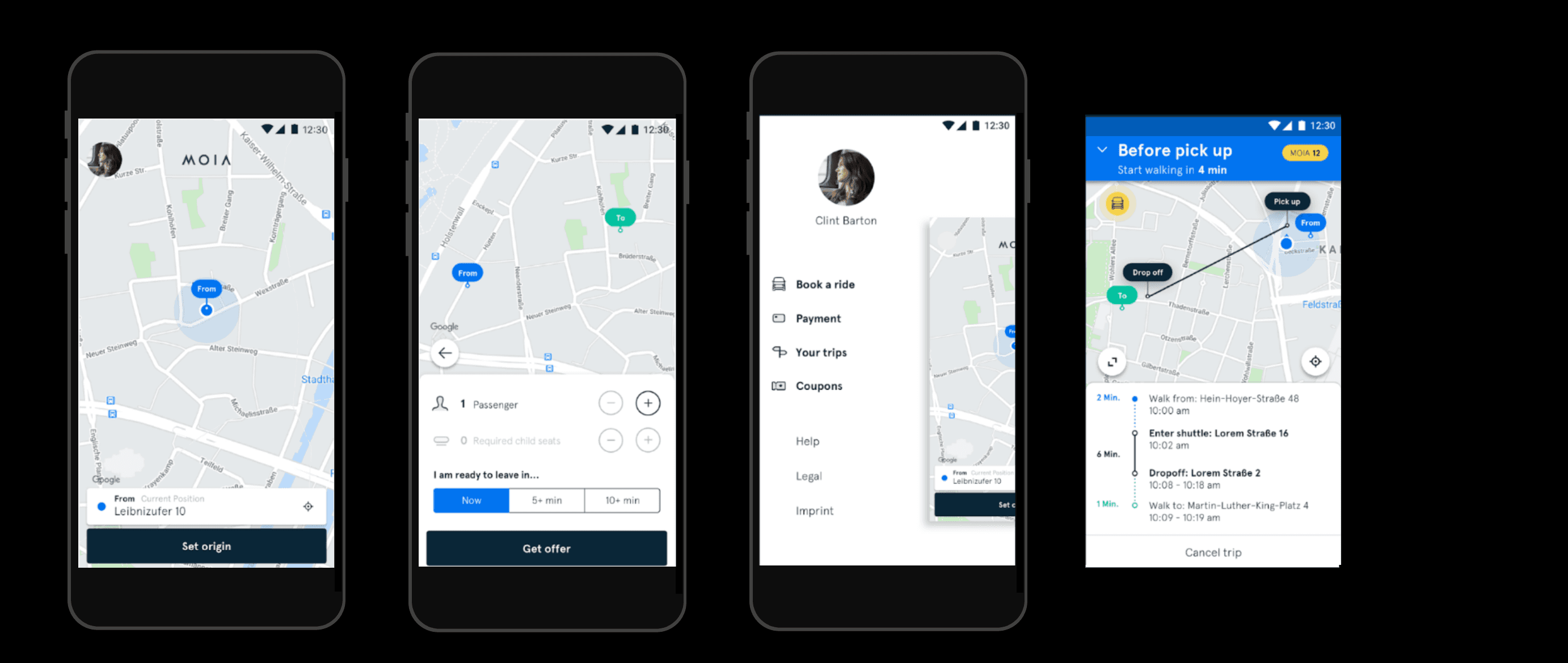
As a UX Designer, I designed the MOIA signup flow for Android, extending the design system to increase conversion rates while ensuring security and usability for ridesharing mobility users.
As a UX Designer, I designed the MOIA signup flow for Android, extending the design system to increase conversion rates while ensuring security and usability for ridesharing mobility users.
MY ROLE
UX / UI Designer
TEAM
Internal team: 1 Lead Designer, 1 Design Director, Development Team, 1 Product Manager
TIMELINE
4 months, 2019
TOOLS
Sketch, Jira
SKILLS I APPLIED
• iOS & Android - UI Design for cross platform native apps
• MVP feature prioritization
• Using user research to drive design decisions
• Atomic design approach in Design Systems
• Development hand-off & collaboration
• User testing - preference test
• Agile collaboration environment
Impact
SUCCESS METRICS
from Ca 41,000
to Ca 260,000
Registrations
4,8/5
Apple App Store &
Google Play Store
DESIGN SYSTEM IMPACT
80%
Decrease in onboarding time for designers
80%
Increase in Development time
By April 2020, the fleet had 100 vehicles, which extended Hamburg's urban mobility with the help of MOIA's algorithm-based electric ridesharing concept.
From January 2019 to April 2020 the user registrations, and app store metrics were succesfully improved by approx. 85%.
Problems
Designing the signup flow for MOIA solved more problems that manifested over the user testing and iteration phase.
#1
Longer signup flow
Before I delivered the user authentication flow there were more use cases that belonged in the onboarding flow such as the coupon offering for first- time users and the onboarding slideshow.
#2
User friction points
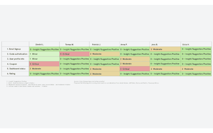
We also tested the MVP app flows which was helpful to uncover several issues.
#3
Security vs. customer engagement signup tradeoff
The development team went back and forth between using the OTP via either mobile or email authentication.
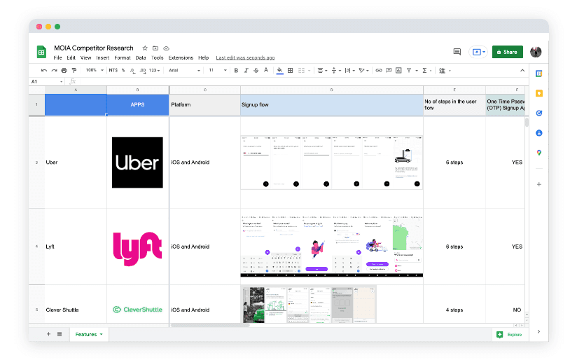
To address the mobile or email back and forth I considered quantitative and qualitative available research data.
#4
Lack of a seamless experience both on iOS and Android
Make our own app for both platforms, with a native feel to the system it’s on.
Opportunity
How might we help passengers achieve a
fast & secure signup ?
Goals
I aligned the design solution with MVP objectives, business requirements, and user goals to ensure a balanced and scalable product launch.
MVP launch goal
• launch the app app with the essential functionality as soon as possible for early users
• minimum functionality required for early users
• release the product as soon as possible
• gather feedback from users
• iterate based on the feedback
Business requirements
• increase registrations
• drive engagement & retention for the MVP app launch in Hamburg
User goals
• new users need a fast and secure user signup in order to use the app as soon as possible to order a ride-sharing car
• have a seamless experience both on iOS and Android
When designing the solutions aspects such as the MVP goal, business requirements and user goals were considered
Longer signup flow
→
Keeping the essential
I collaborated with the team in deciding the most basic features needed for the product to launch. The coupon offering and the onboarding slideshow were left out, at this stage. What was kept was only what allowed for the product to be deployed, excluding non essential features.
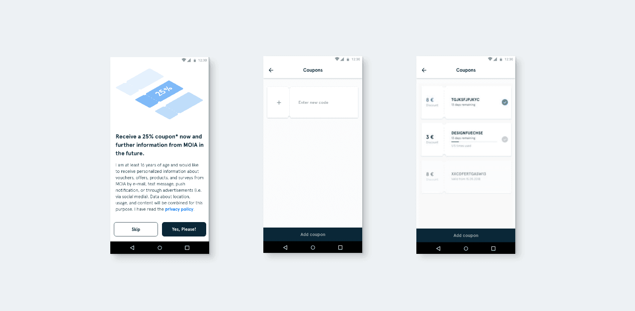
When designing the solutions aspects such as the MVP goal, business requirements and user goals were considered
Longer signup flow
→
Keeping the essential
I collaborated with the team in deciding the most basic features needed for the product to launch. The coupon offering and the onboarding slideshow were left out, at this stage. What was kept was only what allowed for the product to be deployed, excluding non essential features.
User friction points
→
UX improvements
Improving the UX, so that the signup process does not take longer than needed.
#1
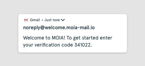
Lack of numbers visibility when extracting the code
Before I delivered the user authentication flow there were more use cases that belonged in the onboarding flow such as the coupon offering for first- time users and the onboarding slideshow.
→
Solution
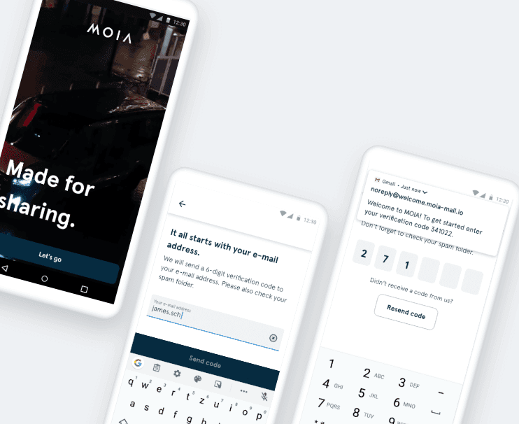
Using microcopy to address the code visibility issue
I iterated on the text to be clear & short while prioritizing
• welcoming the user
• purpose of using the code
• the actual code
This is a typical example of how mastering microcopy or writing clear & short texts can have a huge UX impact.
#2
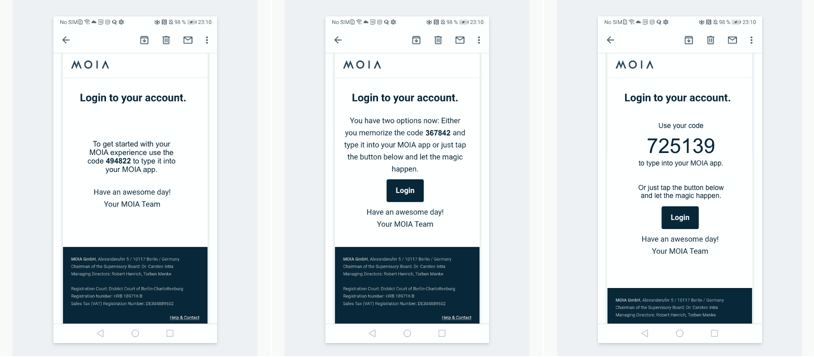
Missing the code & switching between apps
We also tested the MVP app flows which was helpful to uncover several issues.
→
Solution
Implemented visual hierarchy & magic link
To address this I worked on iterating on the welcome email so that users spend the least amount of time scanning the email and getting what is needed - the code (OTP).
I implemented visual hierarchy to address the problem of needing to extract the code fast. And have also cut out out the clutter from the email.
#3
Security vs. customer engagement signup tradeoff
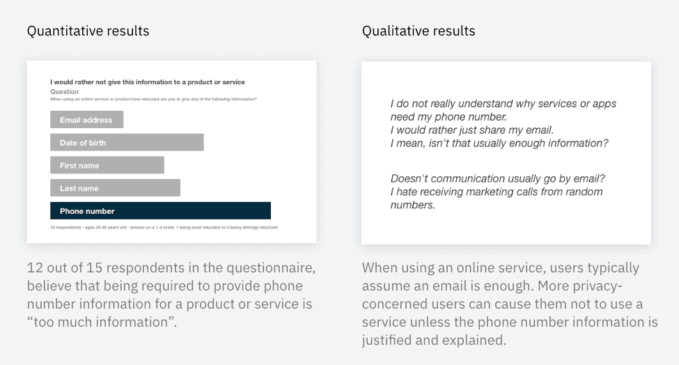
The development team went back and forth between using the OTP via either mobile or email authentication.
To address the mobile or email back and forth I considered quantitative and qualitative available research data.
→
Solution
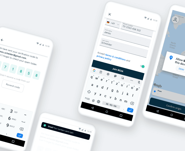
Based on available data & business needs I designed the flow with the email authentication
• Email registration is also a good post-verification marketing channel that can be used beyond for just receiving the code to drive customer engagement & retention.
• Users can receive a welcome email during the sign-up process which encourages more engagement and retention.
• Users can still verify their phone number but at a later stage during the use of the app.
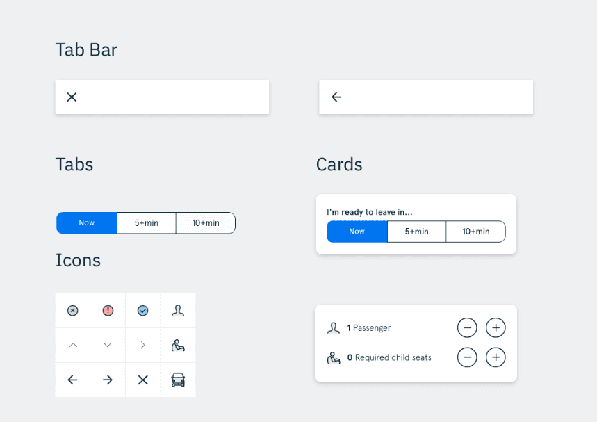
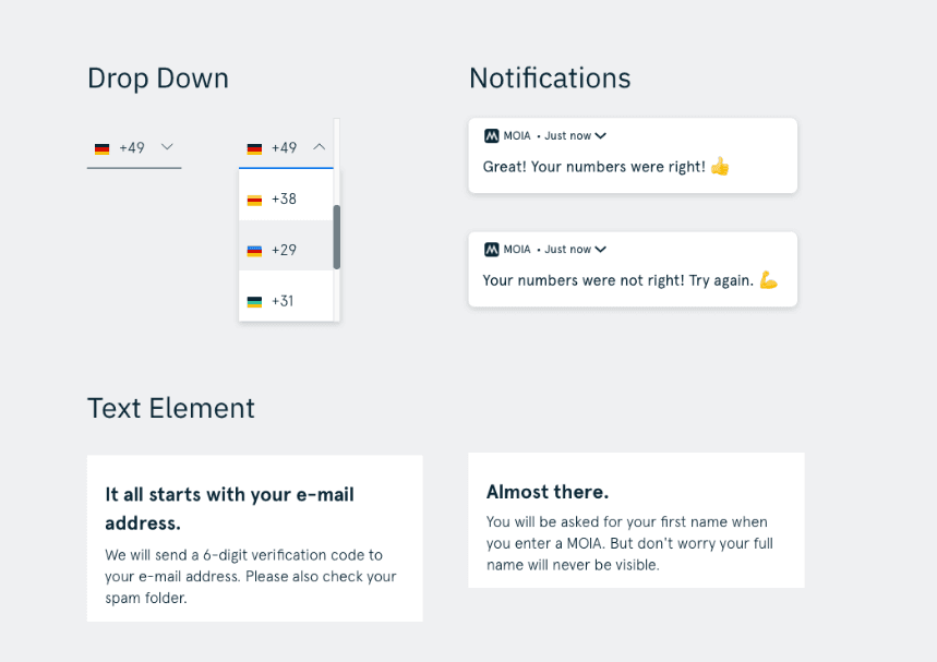
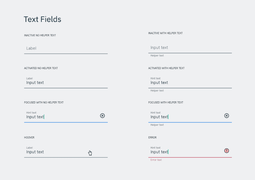
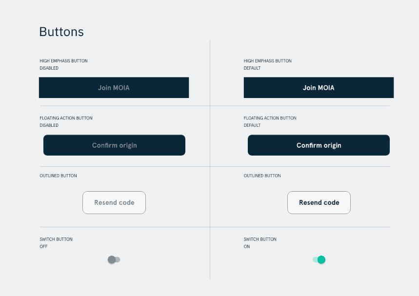
Design System
I progressed in creating our own custom version for Android - with a native cross-platform app approach.
The goal was to make our own app for both platforms, with a native feel to the system it’s on. I reviewed how popular apps deal with designing components for both iOS and Android.
Design iterations
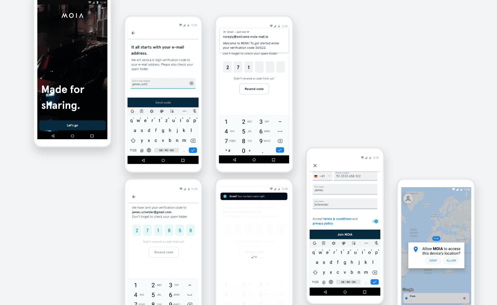
Based on the user testing and iteration phase the I have refined the signup flow with fewer steps and necessary optimisations.
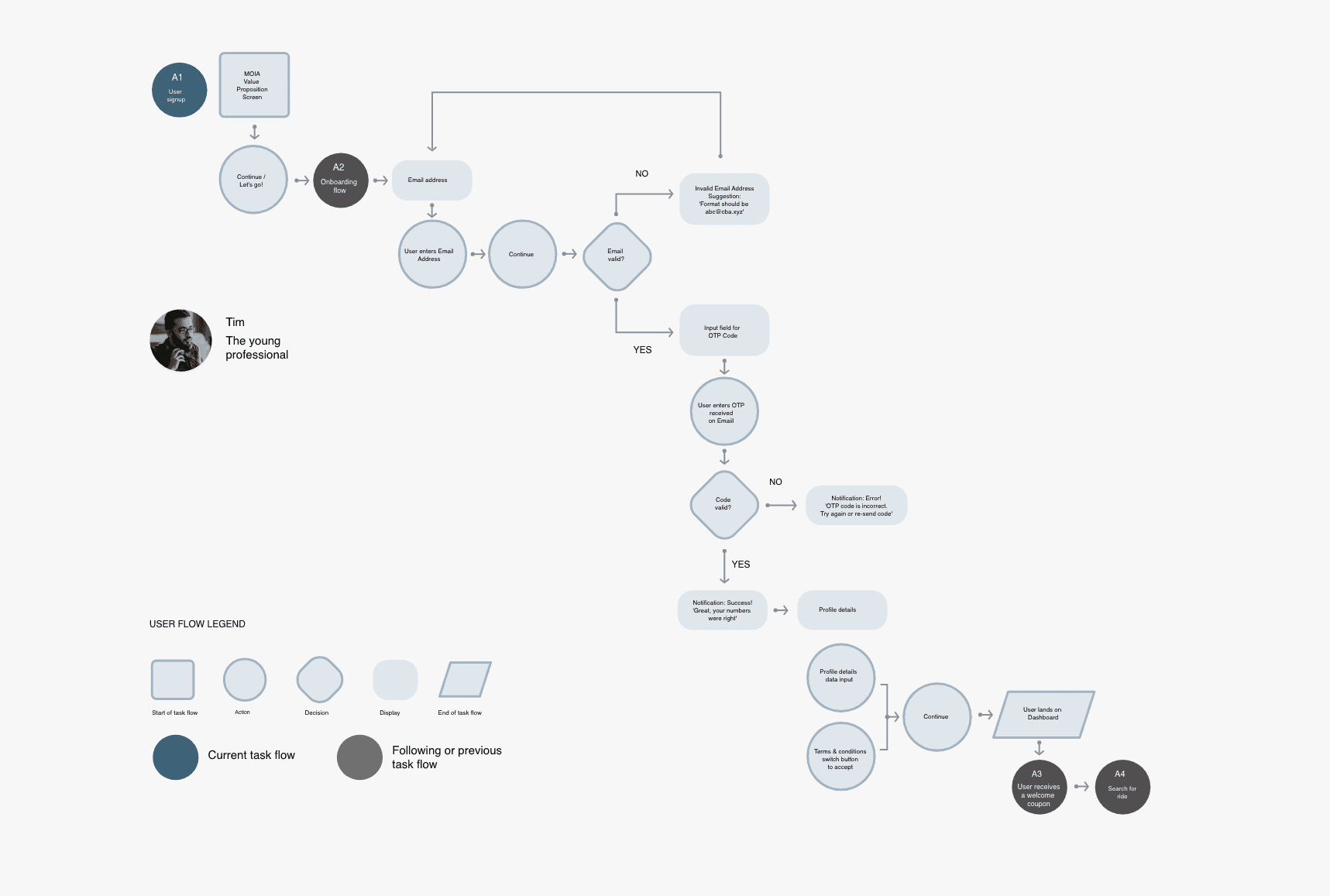
App Flow V1
INITIAL FLOW
The initial flow consisted of:
An onboarding slideshow and a first-time user coupon offering.
Phone-based SMS authentication, which was later transitioned to email authentication.
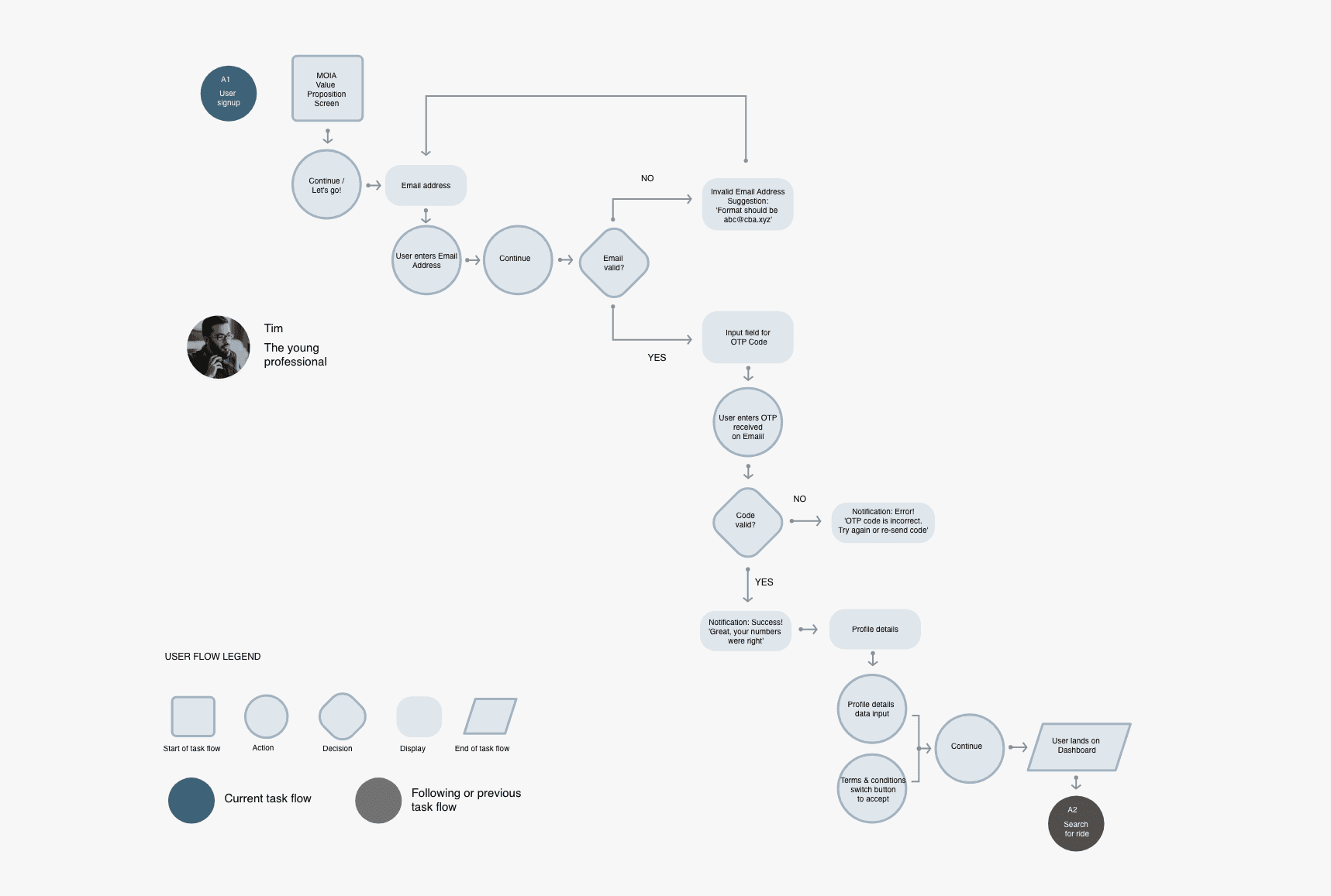
App Flow V2
REFINED FLOW
The refined flow omits the unnecessary and additional steps and instead focuses on the core flow and simplified A-B experience
Final designs
I optimized the design to achieve a 6x increase in conversion volume, directly contributing to the successful April 2020 rollout of the 100-vehicle electric fleet.
#1
Lack of numbers visibility when extracting the code
Before I delivered the user authentication flow there were more use cases that belonged in the onboarding flow such as the coupon offering for first- time users and the onboarding slideshow.
→
Solution
Using microcopy to address the code visibility issue
I iterated on the text to be clear & short while prioritizing
• welcoming the user
• purpose of using the code
• the actual code
This is a typical example of how mastering microcopy or writing clear & short texts can have a huge UX impact.
#2
Missing the code & switching between apps
We also tested the MVP app flows which was helpful to uncover several issues.
→
Solution
Implemented visual hierarchy & magic link
To address this I worked on iterating on the welcome email so that users spend the least amount of time scanning the email and getting what is needed - the code (OTP).
I implemented visual hierarchy to address the problem of needing to extract the code fast. And have also cut out out the clutter from the email.
#3
Security vs. customer engagement signup tradeoff
The development team went back and forth between using the OTP via either mobile or email authentication.
To address the mobile or email back and forth I considered quantitative and qualitative available research data.
→
Solution
Based on available data & business needs I designed the flow with the email authentication
• Email registration is also a good post-verification marketing channel that can be used beyond for just receiving the code to drive customer engagement & retention.
• Users can receive a welcome email during the sign-up process which encourages more engagement and retention.
• Users can still verify their phone number but at a later stage during the use of the app.
INITIAL FLOW
• Initially the flow included
-the onboarding slideshow (A2)
-the coupon offering for first-time users (A3)
• Also it had the phone number code authentication instead of the email authentication
REFINED FLOW
The refined flow omits the unnecessary and additional steps and instead focuses on the core flow and simplified A-B experience
Impact
SUCCESS METRICS
from Ca 41,000
to Ca 260,000
Registrations
4,8/5
Apple App Store &
Google Play Store
DESIGN SYSTEM IMPACT
80%
Decrease in onboarding time for designers
80%
Increase in Development time
By April 2020, the fleet had 100 vehicles, which extended Hamburg's urban mobility with the help of MOIA's algorithm-based electric ridesharing concept.
From January 2019 to April 2020 the user registrations, and app store metrics were succesfully improved by approx. 85%.
Problems
Designing the signup flow for MOIA solved more problems that manifested over the user testing and iteration phase.
#1
Longer signup flow
Before I delivered the user authentication flow there were more use cases that belonged in the onboarding flow such as the coupon offering for first- time users and the onboarding slideshow.
#2
User friction points
We also tested the MVP app flows which was helpful to uncover several issues.
#3
Security vs. customer engagement signup tradeoff
The development team went back and forth between using the OTP via either mobile or email authentication.
To address the mobile or email back and forth I considered quantitative and qualitative available research data.
#4
Lack of a seamless experience both on iOS and Android
Make our own app for both platforms, with a native feel to the system it’s on.
Opportunity
How might we help passengers achieve a
fast & secure signup ?
Goals
I aligned the design solution with MVP objectives, business requirements, and user goals to ensure a balanced and scalable product launch.
MVP launch goal
• launch the app app with the essential functionality as soon as possible for early users
• minimum functionality required for early users
• release the product as soon as possible
• gather feedback from users
• iterate based on the feedback
Business requirements
• increase registrations
• drive engagement & retention for the MVP app launch in Hamburg
User goals
• new users need a fast and secure user signup in order to use the app as soon as possible to order a ride-sharing car
• have a seamless experience both on iOS and Android
User friction points
→
UX improvements
Improving the UX, so that the signup process does not take longer than needed.
Design System
I progressed in creating our own custom version for Android - with a native cross-platform app approach.
The goal was to make our own app for both platforms, with a native feel to the system it’s on. I reviewed how popular apps deal with designing components for both iOS and Android.
Design iterations
Based on the user testing and iteration phase the I have refined the signup flow with fewer steps and necessary optimisations.
Final designs