

DocMe
DocMe
Health App & Platform | HealthTech
Health App & Platform | HealthTech
0 to 1 - B2B2C Product
Lead Product Designer
End-to End
Adoption avg +68%:
MAU +50%
Retention 50% (6 mths), etc.
*currently 360Me
Challenge
As the Lead Product Designer, I designed for DocMe—a two-sided platform bridging the gap between proactive personal tracking and clinical decision-making to encourage early adoption for its launch in the UK.
Working as the 2 team designer in a cross-functional, 15-person remote team, I balanced complex technical and regulatory dependencies to build trust & drive adoption through the user experience.
Impact
Product Adoption
Adoption +68%
+68%
Indicators
Trust score
iOS Before 65/100 - After 85/100
+31%
MAU
iOS Before 40 users - After 60 users
+50%
DAU
iOS Before 40 users - After 60 users
+100%
Retention (6 mths)
iOS Before 40 users - After 60 users
+50%
Satisfaction score
iOS Before 40 users - After 60 users
+29%
NPS
iOS Before 40 users - After 60 users
+150%
App rating
Before 4.6 iOS | 4.5 Android After 4.7 iOS | 4.6 Android
+2%
Business Traction
Accepted into 3+ Accelerators (including Cambridge Judge Business School & Panacea Accelerator UK/US).
Secured 2 Letters of Intent (LOIs) for B2B SDK integrations with Health Insurance and Fitness Tech companies
Overview & Context

Role
End-to-End:
UX Design
UI Design

Company
DocMe - Cambridge University alumni startup backed by seed funding.

Platform
Mobile iOS
Mobile Android
SaaS Web App

Duration
1 year, 2021

Tools
Figma
GitHub
Jira
Miro
Notion

Team
Management (3),
Development (5)
Computer Vision (5)
Marketing (2)
Goals
Launch
Ship an MVP in 6 months to gather user feedback and iterate.
Build trust
DocMe Doctors: Integrated secure NHS Login and tested in the NHS Sandpit environment.
DocMe Personal: Secured the UKCA mark and designed transparent data usage controls.
Grow
Achieve UK product-market fit in 12 months by targeting Cambridge Colleges (Mobile) and HealthTech startups (SaaS) for early traction.
Constraints
Designing for trust, engagement & adoption
Product and business goals directly guided feature prioritization.
Small Design, Dev, Computer Vision teams
With a lean 15-person team, we prioritized intentionally to ship impactful, incremental design updates.
Technical considerations
Core features required managing complex technical dependencies that directly shaped the UI and interaction design.
Target users
DocMe is a two-sided platform designed to bridge the gap between proactive personal health tracking and clinical decision-making.
Patients (B2C)
Health-conscious individuals and students wanting a reliable, single platform to track vitals remotely and share accurate data with their doctors
Clinicians (B2B SaaS)
Overloaded GPs needing instant, secure access to continuous patient history to speed up triage and replace clunky legacy software.
Problem
Patients (B2C) struggled with manual vital sign data entry for doctors, facing high input friction, fragmentation, missing critical windows for preventing health conditions
1/3 of doctors consultations
require vital signs measurements
77% of healthcare sector
is still tech-limited
by outdated software
60% doctors view
vitals & lifestyle tracking
as a missed opportunity
preventing chronic conditions.
Data derived from
Interviews: 6x Health & Fitness App Users,
Surveys: 122x Oxford University Students - different colleges (for Personal app)
Interviews: 6x Private Clinics Doctors Interview, and 3 Health Tech Startups in the UK (for Doctors app)
Solution
Helping users track daily habits to see the direct impact on their health through vital signs data.
People
Core Feature
Unified Preventative Health
I designed an intuitive mobile experience that removes the friction of fragmented tracking, turning vital signs into easily digestible insights shared directly with doctors.
The 3-Step Core Flow
Measure Vitals
Users capture accurate, real-time vital signs effortlessly using our remote camera-based selfie scan.
Assessment
The app instantly processes the data, providing clear metrics regarding heart rate, blood pressure, etc. based on NHS Protocols.
Share Results with Doctor
With a single tap, users can securely transmit their continuous health history directly to their GP, replacing clunky legacy check-ups with precise data.

People
From Core Feature -> Product Vision
Correlating Behavior with Biometrics
While camera-based vital scanning is the platform's core technical achievement, the long-term design vision shifts the product from a reactive measurement tool into a proactive habit builder.
The 3-Step Core Flow
Add your Goals
We introduced smart health goals tailored to specific biometric needs. Users can easily track vital signs, target custom nutrition protocols, or set specific activity thresholds directly from their main dashboard.
Assessment
To prevent app fatigue, we consolidated fragmented daily habits into a clean, unified logging system. The interface makes tracking sleep, weight, nutrition, and daily movement frictionless via a quick-action center.
Share Results with Doctor
With a single tap, users can securely transmit their continuous health history directly to their GP, replacing clunky legacy check-ups with precise data.


Doctors
Core Feature
A Secure, Integrated Clinical Dashboard
I prioritized reflecting real-time patient vital results directly into a specialized clinicians' platform, building the entire interface within the secure NHS Sandpit environment. The design streamlines remote monitoring, providing a single source of truth for patient triage.
The 3-Step Core Flow
Add Patient
Clinicians can quickly expand their care list by adding individual patients or entire groups via an authenticated workflow.
Request / Receive Vitals
Doctors seamlessly trigger a live vitals request. The system syncs with the patient's mobile app, loading real-time biometrics instantly.
Patient Overview
A unified data workspace that cleanly reflects, aggregates, and organizes continuous historical data, and the vitals metrics.

Doctors
From Core Feature -> refining the Workflow
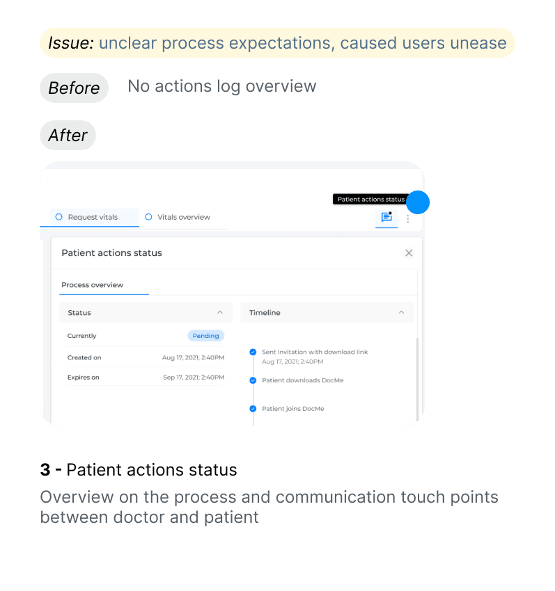
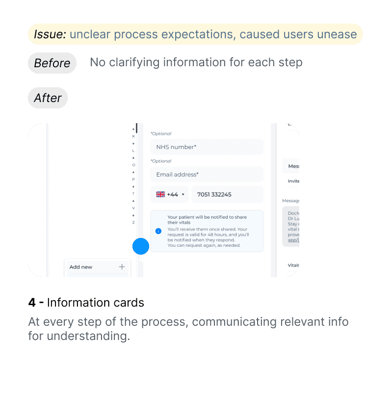
Guiding the Doctor through the Patient-Doctor Synch workflow
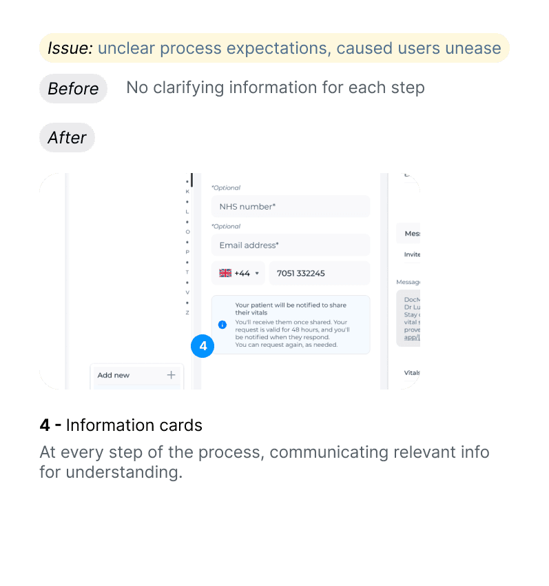
While testing data reflection within a secure NHS environment solved our core engineering and regulatory dependencies, the design refinements I focused further prioritized optimizing the workflow such as reducing unclear process expectations.


Process
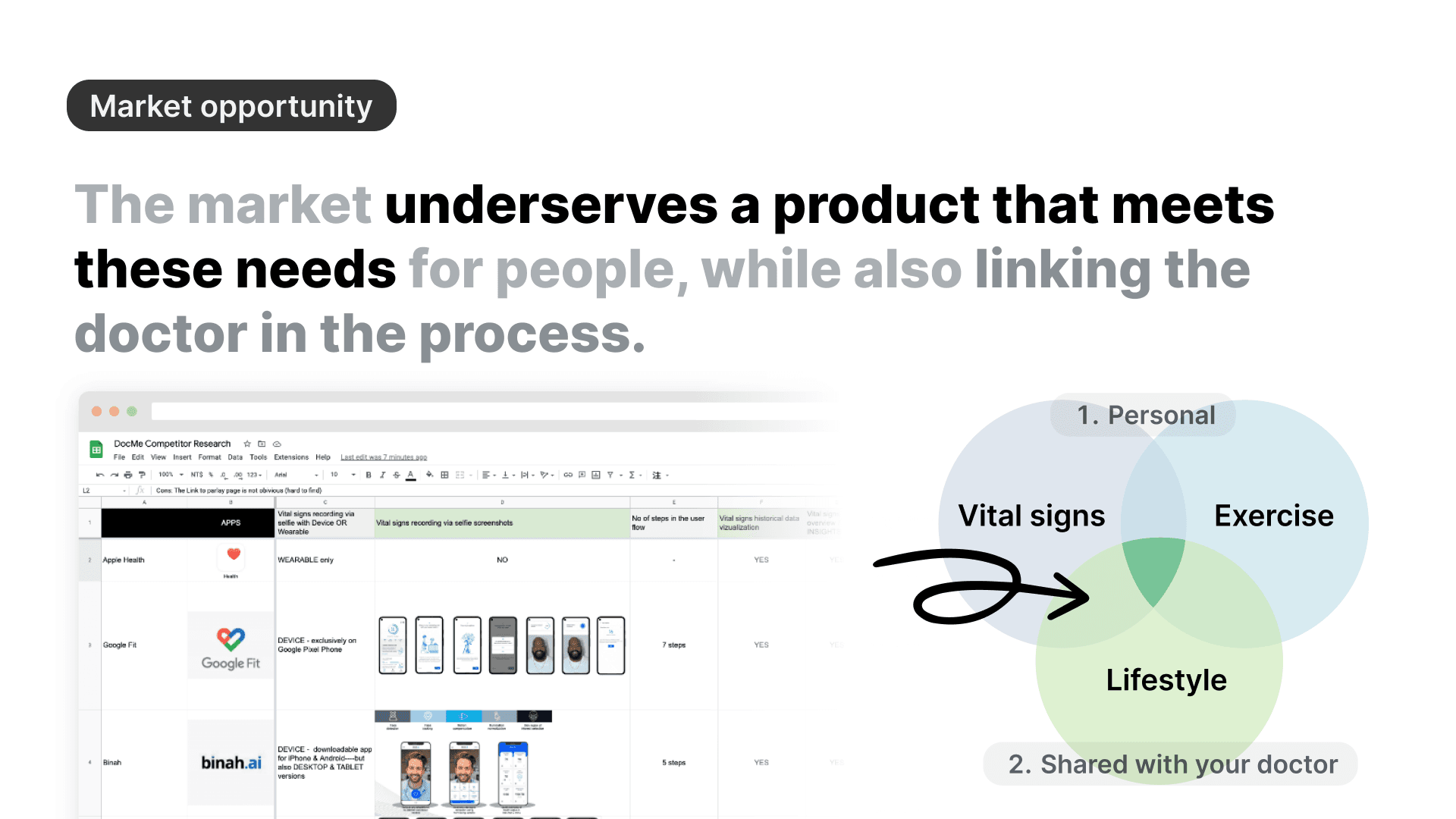
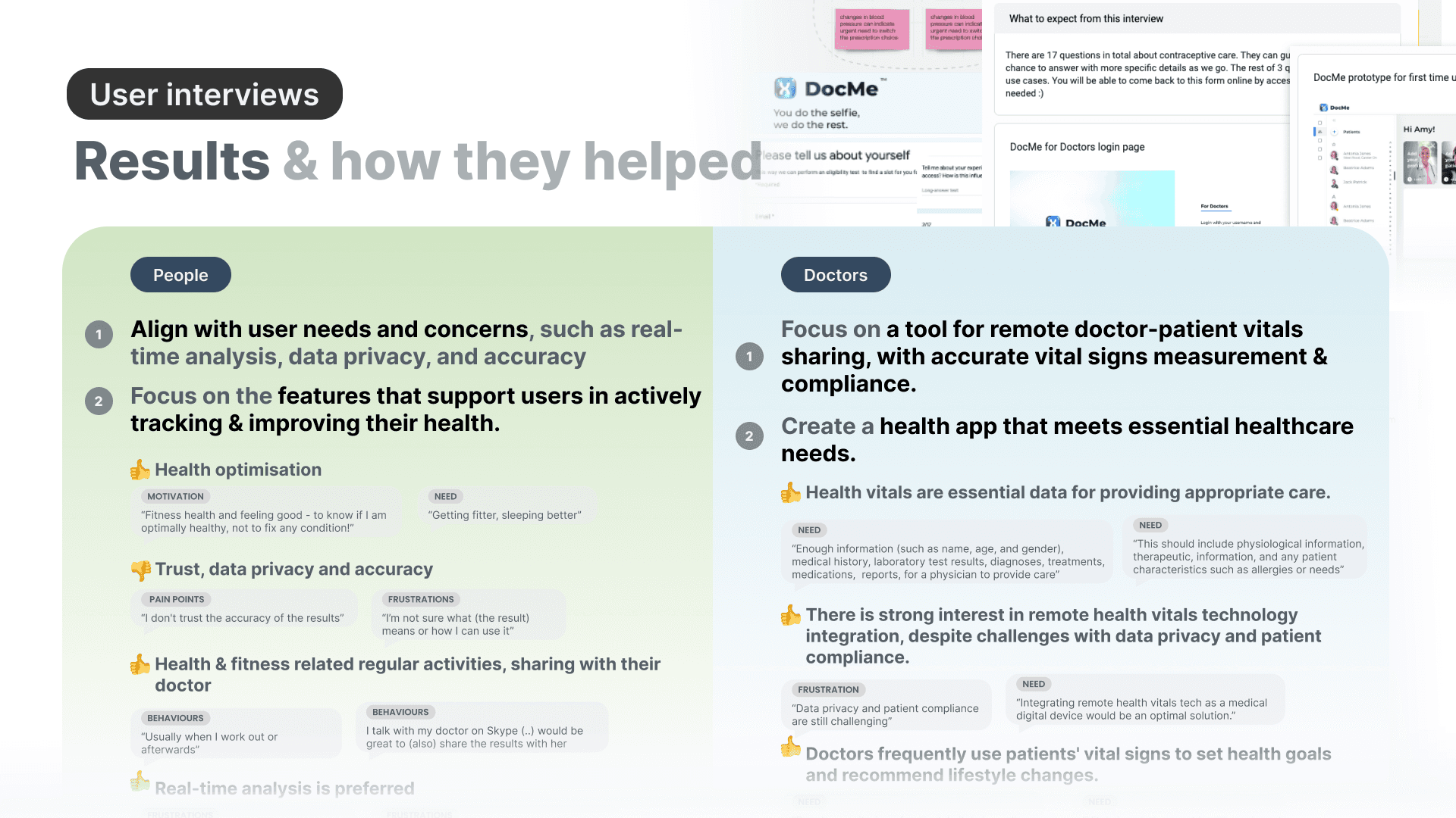
Based on the research opportunities,
I collaborated with stakeholders & dev to prioritise features into core & functional areas
General Product Research
Discovery





Feature Prioritization
Measure Vitals
Onboarding & Sign-up
Doctors Platform
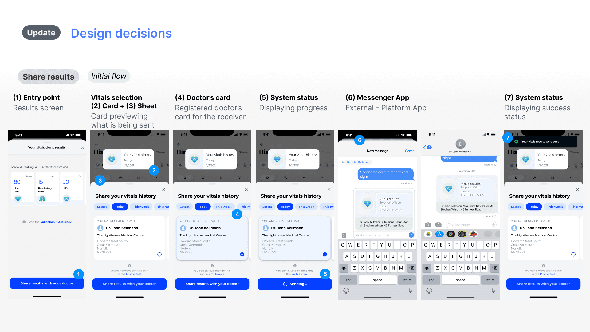
Vitals history, overview & sharing
5. Health assesment & health goals

Feature
Measure Vitals



1st Launch
Experimental MVP
User Testing 1st Launch
Hypothesis (1st Launch)
If we provide
a basic camera selfie scan,
users will successfully record and share their vitals despite minimal UI guidance.
UX/UI Implementation
• Positioning: Static object-focus border.
• Timer: Indeterminate circular loader + basic countdown text.
• Results: Modal dialog window.
Testing Outcomes & User Feedback
• High anxiety during seconds 5–10 due to invisible progress status.
• Users dropped off from framing confusion.
• Data shock from dense clinical layout in small modal.
Improvement
• Task Completion: 100%
• Low error rate: 1.5
• Time-to-Completion: 18s vs. 15s target
• The Baseline NPS: 71.43
• Satisfaction: 85.7%
2nd Launch
Refined Interaction Loop
User Testing 2nd Launch
Hypothesis (2nd Launch)
If we provide
real-time visual anchoring (determinate countdowns and framing indicators),
users will overcome the 15-second scanning anxiety.
UX/UI Implementation
• Positioning: Real-time, progress circle around face.
• Timer: Determinate linear progress bar with absolute countdown.
• Results: Expandable full-screen bottom sheet.
Testing Outcomes & User Feedback
• Scanning anxiety eliminated; the 15 seconds felt fast and predictable.
• Seamless, unspoken user self-correction for lighting/posture.
• High data comprehension and readability.
Improvement
• Satisfaction: +25.45%
• Perceived Performance: ~+40%
• Returning Users: +40%
3rd Update
Trust Optimisations
User Testing 3rd Update
Hypothesis (3rd Launch)
If we combine
cards on the dashboard, trust info data sheets,
we optimize feature discovery and medical trust.
UX/UI Implementation
• Entry Point: Highly visible CTA Promotion Cards + Grid dashboard.
• Trust: Added "Validation & Accuracy" badges to biometric summaries.
• Data: Specialized card groupings for complex trends.
Testing Outcomes & User Feedback
• Clear discovery for feature
• High user trust
Improvement
1.Micro-Engagement → Macro-Adoption (MAU/DAU)
Result: DAU doubled (+100%, 4 to 8 users) and MAU spiked 50% (40 to 60 users)
2. Eliminating confusion → Trust
3.Retention → B2B monetisation (2 LOIs) product stickiness.
Feature
Onboarding & Sign-up


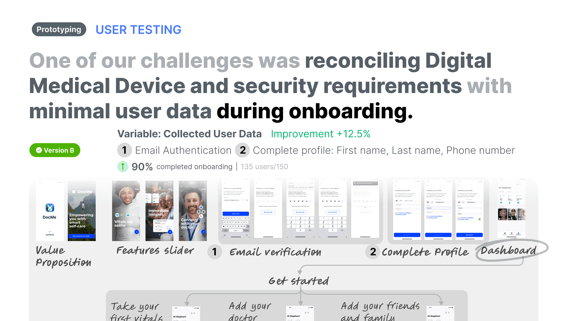


Feature
Doctors Platform


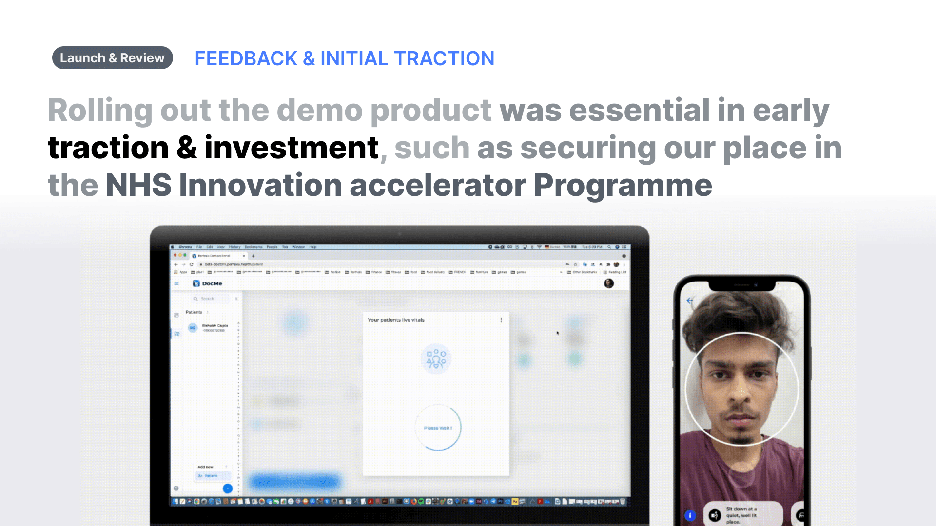


Feature
Vitals history, overview & sharing


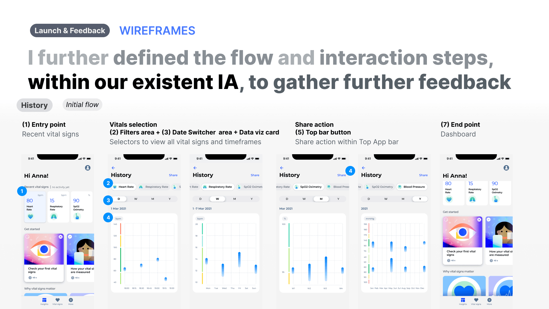
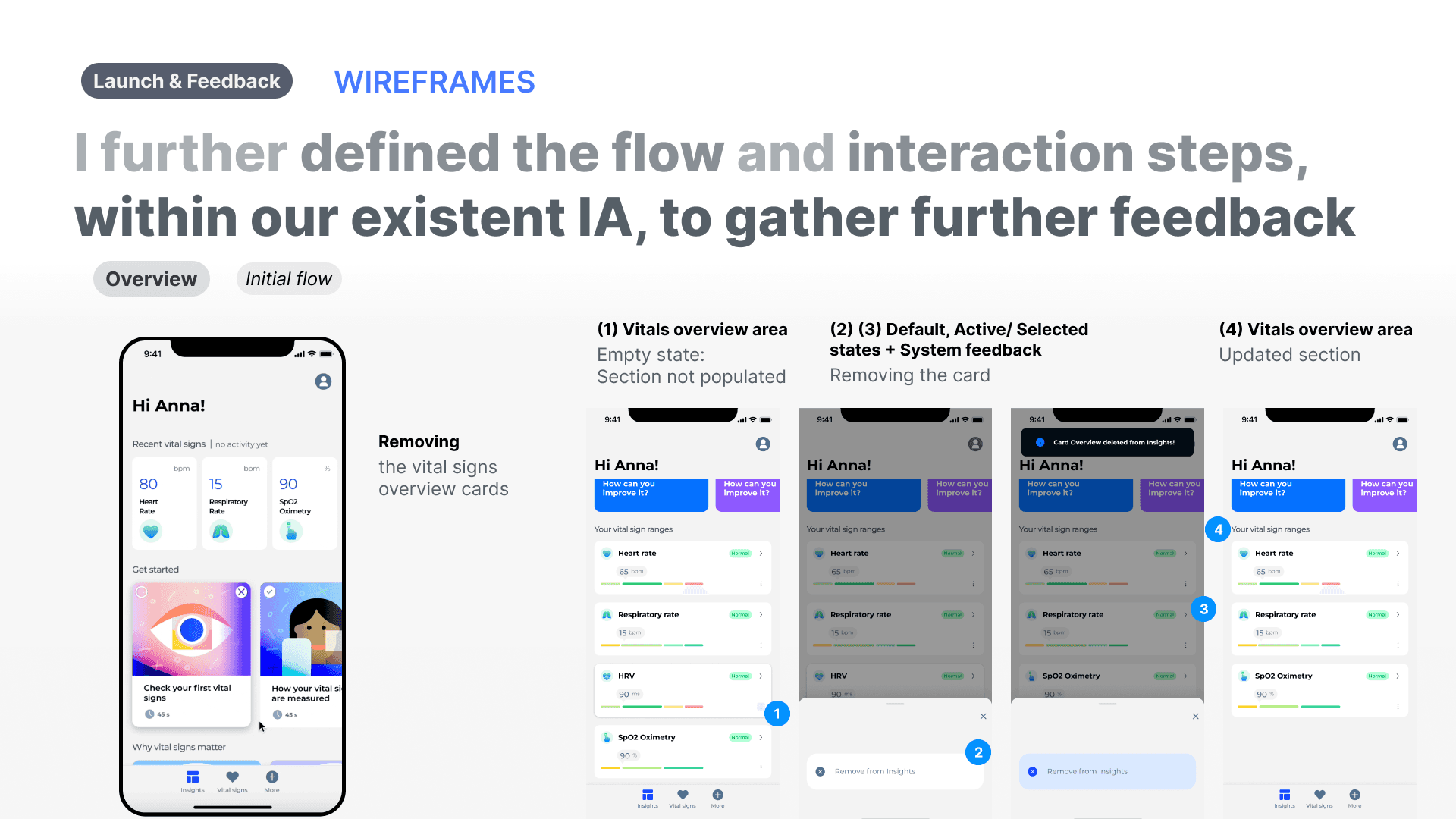


Feature
Health assesment & health goals


Learnings & next steps
As DocMe pivoted into 360Me, the boosted trust scores & stabilized +68% adoption provided the critical proof needed to reposition our core camera telemetry into a premium consumer market focused on BioAge.
Stabilizing the early MVP through improved user trust and adoption gave our pre-revenue team the insights and confidence needed to shift strategy. While the new value proposition aligns with our initial vision of correlating behavior with vitals, it strategically bypasses complex, rigid NHS regulatory dependencies to pivot directly into the premium consumer longevity market.
What worked well
Including stakeholders & tech early in the design process
Product Design is cross-collaborative.
To improve collaboration, I tried to involve the tech team in multiple points within the design process. As they often had better insight into data, edge cases, and other parts that did not identify.
Forming an understanding through multiple research approaches
I combined Qualitative & Quantitative research.
Using tools such as Maze, Test Flight & aws Analytics, Feedback user Channels I was able to test the concept & validate our hypothesis
What I could have done better
Define a clear scope & problem statement earlier
If the problem is not clearly framed, it can result in endless design iterations that are difficult to test.
The strategy fluctuated between applying vital signs insights to areas such as fitness, medical, health insurance without deciding on a clearer opportunity or area of intersection
Better structured
user testing sessions
Although we used multiple feedback sources, I would have loved to use more often task-based user flows, in tools such as Maze, for a more structured approach.
Challenges
Small number of users
Small team & lack of processes
Lack of design maturity
Small early stage funding
1 full time, 1 part time Product Designers
Opportunities
Easier access to users that are passionate about the topic & product mission
Defining collaboration process with the team
Participating in the hiring process for new team members in other teams.
Practice communicating design decisions
Improving design + dev collaboration
Contributing to the investor pitch deck
Presentations in meetings
Limited design team collaboration, and closer Stakeholder collaboration
Challenge
As the Lead Product Designer, I designed for DocMe—a two-sided platform bridging the gap between proactive personal tracking and clinical decision-making to encourage early adoption for its launch in the UK.
Working as the 2 team designer in a cross-functional, 15-person remote team, I balanced complex technical and regulatory dependencies to build trust & drive adoption through the user experience.
Impact
Product Adoption
Adoption +68%
+68%
Indicators
Trust score
iOS Before 65/100 - After 85/100
+31%
MAU
iOS Before 40 users - After 60 users
+50%
DAU
iOS Before 40 users - After 60 users
+100%
Retention (6 mths)
iOS Before 40 users - After 60 users
+50%
Satisfaction score
iOS Before 40 users - After 60 users
+29%
NPS
iOS Before 40 users - After 60 users
+150%
App rating
Before 4.6 iOS | 4.5 Android After 4.7 iOS | 4.6 Android
+2%
Business Traction
Accepted into 3+ Accelerators (including Cambridge Judge Business School & Panacea Accelerator UK/US).
Secured 2 Letters of Intent (LOIs) for B2B SDK integrations with Health Insurance and Fitness Tech companies
Overview & Context
Role
End-to-End:
UX Design
UI Design
Company
DocMe - Cambridge University alumni startup backed by seed funding.
Platform
Mobile iOS
Mobile Android
SaaS Web App
Duration
1 year, 2021
Tools
Figma
GitHub
Jira
Miro
Notion
Team
Management (3),
Development (5)
Computer Vision (5)
Marketing (2)
Goals
Launch
Ship an MVP in 6 months to gather user feedback and iterate.
Build trust
DocMe Doctors: Integrated secure NHS Login and tested in the NHS Sandpit environment.
DocMe Personal: Secured the UKCA mark and designed transparent data usage controls.
Grow
Achieve UK product-market fit in 12 months by targeting Cambridge Colleges (Mobile) and HealthTech startups (SaaS) for early traction.
Constraints
Designing for trust, engagement & adoption
Product and business goals directly guided feature prioritization.
Small Design, Dev, Computer Vision teams
With a lean 15-person team, we prioritized intentionally to ship impactful, incremental design updates.
Technical considerations
Core features required managing complex technical dependencies that directly shaped the UI and interaction design.
Target users
DocMe is a two-sided platform designed to bridge the gap between proactive personal health tracking and clinical decision-making.
Patients (B2C)
Health-conscious individuals and students wanting a reliable, single platform to track vitals remotely and share accurate data with their doctors
Clinicians (B2B SaaS)
Overloaded GPs needing instant, secure access to continuous patient history to speed up triage and replace clunky legacy software.
Problem
Patients (B2C) struggled with manual vital sign data entry for doctors, facing high input friction, fragmentation, missing critical windows for preventing health conditions
1/3 of doctors consultations
require vital signs measurements
77% of healthcare sector
is still tech-limited
by outdated software
60% doctors view
vitals & lifestyle tracking
as a missed opportunity
preventing chronic conditions.
Data derived from
Interviews: 6x Health & Fitness App Users,
Surveys: 122x Oxford University Students - different colleges (for Personal app)
Interviews: 6x Private Clinics Doctors Interview, and 3 Health Tech Startups in the UK (for Doctors app)
Solution
Helping users track daily habits to see the direct impact on their health through vital signs data.
People
Core Feature
Unified Preventative Health
I designed an intuitive mobile experience that removes the friction of fragmented tracking, turning vital signs into easily digestible insights shared directly with doctors.
The 3-Step Core Flow
Measure Vitals
Users capture accurate, real-time vital signs effortlessly using our remote camera-based selfie scan.
Assessment
The app instantly processes the data, providing clear metrics regarding heart rate, blood pressure, etc. based on NHS Protocols.
Share Results with Doctor
With a single tap, users can securely transmit their continuous health history directly to their GP, replacing clunky legacy check-ups with precise data.
People
From Core Feature ->
Product Vision
Correlating Behavior with Biometrics
While camera-based vital scanning is the platform's core technical achievement, the long-term design vision shifts the product from a reactive measurement tool into a proactive habit builder.
The 3-Step Core Flow
Add your Goals
We introduced smart health goals tailored to specific biometric needs. Users can easily track vital signs, target custom nutrition protocols, or set specific activity thresholds directly from their main dashboard.
Assessment
To prevent app fatigue, we consolidated fragmented daily habits into a clean, unified logging system. The interface makes tracking sleep, weight, nutrition, and daily movement frictionless via a quick-action center.
Share Results with Doctor
With a single tap, users can securely transmit their continuous health history directly to their GP, replacing clunky legacy check-ups with precise data.
Doctors
Core Feature
A Secure, Integrated Clinical Dashboard
I prioritized reflecting real-time patient vital results directly into a specialized clinicians' platform, building the entire interface within the secure NHS Sandpit environment. The design streamlines remote monitoring, providing a single source of truth for patient triage.
The 3-Step Core Flow
Add Patient
Clinicians can quickly expand their care list by adding individual patients or entire groups via an authenticated workflow.
Request / Receive Vitals
Doctors seamlessly trigger a live vitals request. The system syncs with the patient's mobile app, loading real-time biometrics instantly.
Patient Overview
A unified data workspace that cleanly reflects, aggregates, and organizes continuous historical data, and the vitals metrics.
Doctors
From Core Feature -> refining the Workflow
Guiding the Doctor through the Patient-Doctor Synch workflow
While testing data reflection within a secure NHS environment solved our core engineering and regulatory dependencies, the design refinements I focused further prioritized optimizing the workflow such as reducing unclear process expectations.
Process
Based on the research opportunities,
I collaborated with stakeholders & dev to prioritise features into core & functional areas
General Product Research
Discovery
Feature Prioritization
Measure Vitals
Onboarding & Sign-up
Doctors Platform
Vitals history, overview & sharing
5. Health assesment & health goals
Feature
Measure Vitals
User Testing 1st Launch
Hypothesis (1st Launch)
If we provide
a basic camera selfie scan,
users will successfully record and share their vitals despite minimal UI guidance.
UX/UI Implementation
• Positioning: Static object-focus border.
• Timer: Indeterminate circular loader + basic countdown text.
• Results: Modal dialog window.
Testing Outcomes & User Feedback
• High anxiety during seconds 5–10 due to invisible progress status.
• Users dropped off from framing confusion.
• Data shock from dense clinical layout in small modal.
Improvement
• Task Completion: 100%
• Low error rate: 1.5
• Time-to-Completion: 18s vs. 15s target
• The Baseline NPS: 71.43
• Satisfaction: 85.7%
1st Launch
Experimental MVP
2nd Launch
Refined Interaction Loop
User Testing 2nd Launch
Hypothesis (2nd Launch)
If we provide
real-time visual anchoring (determinate countdowns and framing indicators),
users will overcome the 15-second scanning anxiety.
UX/UI Implementation
• Positioning: Real-time, progress circle around face.
• Timer: Determinate linear progress bar with absolute countdown.
• Results: Expandable full-screen bottom sheet.
Testing Outcomes & User Feedback
• Scanning anxiety eliminated; the 15 seconds felt fast and predictable.
• Seamless, unspoken user self-correction for lighting/posture.
• High data comprehension and readability.
Improvement
• Satisfaction: +25.45%
• Perceived Performance: ~+40%
• Returning Users: +40%
3rd Update
Trust Optimisations
User Testing 3rd Update
Hypothesis (3rd Launch)
If we combine
cards on the dashboard, trust info data sheets,
we optimize feature discovery and medical trust.
UX/UI Implementation
• Entry Point: Highly visible CTA Promotion Cards + Grid dashboard.
• Trust: Added "Validation & Accuracy" badges to biometric summaries.
• Data: Specialized card groupings for complex trends.
Testing Outcomes & User Feedback
• Clear discovery for feature
• High user trust
Improvement
1.Micro-Engagement → Macro-Adoption (MAU/DAU)
Result: DAU doubled (+100%, 4 to 8 users) and MAU spiked 50% (40 to 60 users)
2. Eliminating confusion → Trust
3.Retention → B2B monetisation (2 LOIs) product stickiness.
Feature
Onboarding & Sign-up
Feature
Doctors Platform
Feature
Vitals history, overview & sharing
Feature
Health assesment & health goals
Learnings & next steps
As DocMe pivoted into 360Me, the boosted trust scores & stabilized +68% adoption provided the critical proof needed to reposition our core camera telemetry into a premium consumer market focused on BioAge.
Stabilizing the early MVP through improved user trust and adoption gave our pre-revenue team the insights and confidence needed to shift strategy. While the new value proposition aligns with our initial vision of correlating behavior with vitals, it strategically bypasses complex, rigid NHS regulatory dependencies to pivot directly into the premium consumer longevity market.
What worked well
Including stakeholders & tech early in the design process
Product Design is cross-collaborative.
To improve collaboration, I tried to involve the tech team in multiple points within the design process. As they often had better insight into data, edge cases, and other parts that did not identify.
Forming an understanding through multiple research approaches
I combined Qualitative & Quantitative research.
Using tools such as Maze, Test Flight & aws Analytics, Feedback user Channels I was able to test the concept & validate our hypothesis
What I could have done better
Define a clear scope & problem statement earlier
If the problem is not clearly framed, it can result in endless design iterations that are difficult to test.
The strategy fluctuated between applying vital signs insights to areas such as fitness, medical, health insurance without deciding on a clearer opportunity or area of intersection
Better structured
user testing sessions
Although we used multiple feedback sources, I would have loved to use more often task-based user flows, in tools such as Maze, for a more structured approach.
Challenges
Small number of users
Small team & lack of processes
Lack of design maturity
Small early stage funding
1 full time, 1 part time Product Designers
Opportunities
Easier access to users that are passionate about the topic & product mission
Defining collaboration process with the team
Participating in the hiring process for new team members in other teams.
Practice communicating design decisions
Improving design + dev collaboration
Contributing to the investor pitch deck
Presentations in meetings
Limited design team collaboration, and closer Stakeholder collaboration