IBM Studios Spaces
Böblingen
Finding working spaces within the Research & Development Lab
The project has been continued as an individual project for the mobile application app design.

Integrated in Studio Böblingen

Concept - mobile app
Context
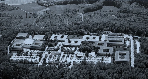
IBM Design Studio, Böblingen needed an easier way to identify and find their working spaces within the Research & Development Lab for their employees & visitors.
Challenges
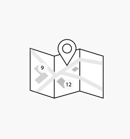
The existing map doesn’t link spaces to the activities within the lab’s buildings, making it difficult for employees and visitors to have visibility on & locate efficiently work or event spaces.
Creating better visibility of the working spaces that change and update frequently within the large Böblingen laboratory.
Constraints
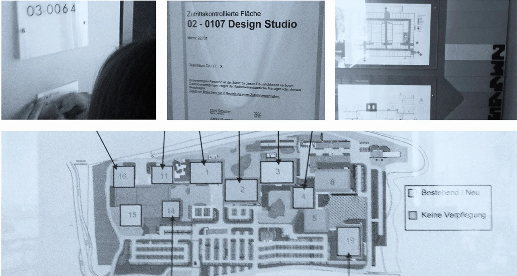
Mapping of the spaces & labelling
Resources - small budget that covers spaces labels and panel (for visualization of the areas)
Technical Considerations - no software for architectural mapping
Orientation app
No buget for orientation app
Solo part of the project
Target users
The large employee population of the IBM Böblingen Research and Development Laboratory
IBM Studio employees
Visitors & employees from other IBM locations
IBM Böblingen employees
Role
UX/UI Designer
Architecture & Visual Design skills: (Axonometric drawing, 3D, 2D mapping)
Company
IBM (Mapping of the spaces & labelling)
Orientation app (solo concept project)
Platform
Wall panels & labels
Mobile iOS device
Duration
3 months
2017
Tools
Sketch, Illustrator,
Axonometric drawing, 3D, 2D spatial mapping
Team
UX Research
Sujith Kumar
Visual Design
Nika Vizintin
UX Design
Selina Magnin


Impact
The wall panel & labels were installed in the Studio Space entrance area
People within the lab and visitors felt they have a better overview on the working spaces and activities within the lab
A hypothetical impact that I would consider can be a north star metric, such as:
"Percentage of users successfully locating their desired space or activity within the lab on their first attempt."
Supportive metrics, could include:
Time spent navigating to a destination.
Frequency of app usage by visitors and employees.
Engagement with the map or activity filters (e.g., number of spaces or activities explored per session).
Process
Problem definition
Contextual research
Interviews
Opportunities
Personas
Pain points
Sketches & Prototypes
Possible design solutions
Prioritization
Gathering user feedback
Prototype testing
Project goals
Creating better visibility of the working spaces throughout (inside) the Böblingen laboratory.
Opportunity
RESEARCH
Research methods
Improving visibility of the dynamic workspaces in Böblingen Lab was challenging. Research included interviewing Design Studio teams and addressing the needs of the lab's large employee population.
Interviews
Contextual inquiry
Different views & plans of the lab

Different views of the IBM Research & Development Lab in Böblingen, Germany; 2D, 3D & reference for scale
Wall map of the IBM Research & Development Lab in Böblingen, Germany and images from inside the lab
SYNTHESIS
Research insights
We narrowed down the main pain points that people were experiencing
Changing Spaces
When working, people are switching between many rooms.
Changing Teams / People Within Teams
They often switch teams for short projects, working in unexpected lab spaces.
The Research & Development Lab Map
The current map lacks an overview of activities within the lab buildings.
Affinity mapping
I synthesized with the team the research findings into key themes to inform our potential design solutions.
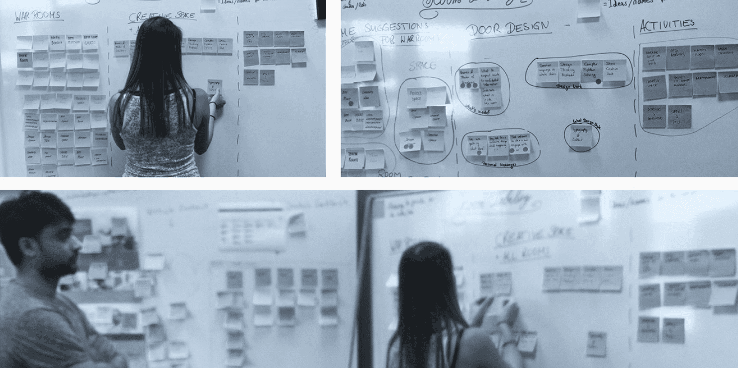
Design thinking session. Clustering the results from the user research questionnaires and findings.
• The teams want to communicate their uniqueness as both individuals and teams.
• Strong local culture that has the potential to be incorporated.
• Creative naming of the spaces is encouraged by the teams.
• People are interested also in communicating the activities in the rooms.
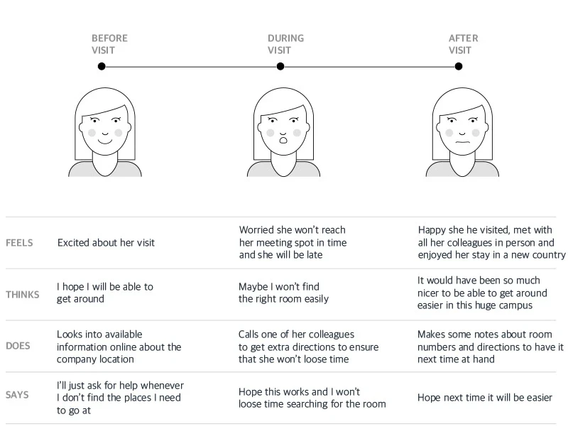
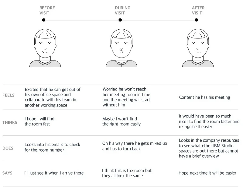
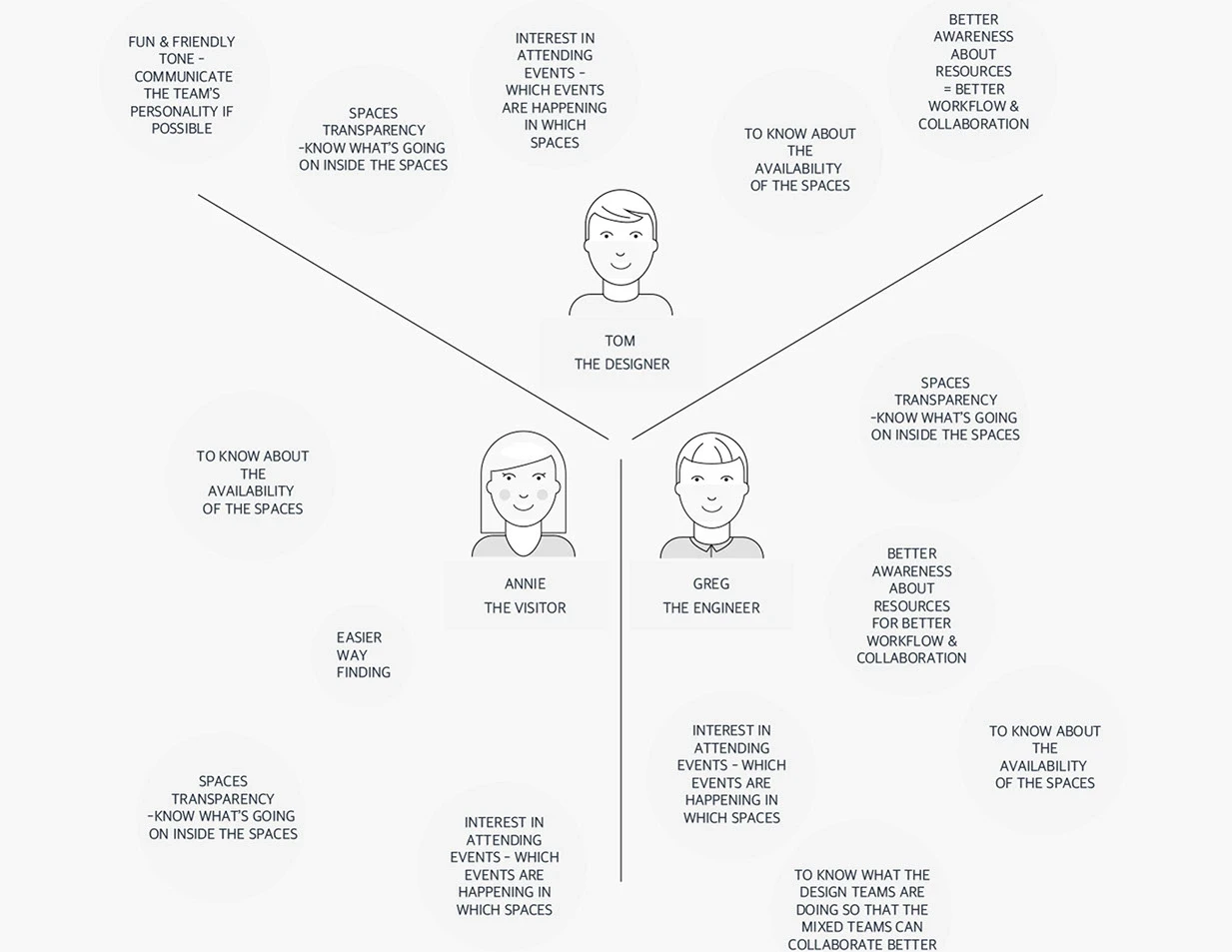
Personas
Three Personas were created based on the research insights from the interviews.
seeks directions
Annie works in the Austin, Texas Design Studio, but part of her team is based in Böblingen, Germany. Visiting the studio for the first time, she wants to explore the spaces independently. However, due to its size, she often asks colleagues for directions. While they’re helpful, the studio is sometimes empty as people work in team spaces elsewhere in the lab, making self-navigation essential.
needs to switch rooms for collaboration
Greg enjoys collaborating with his design team but works in a different part of the IBM R&D Lab. With team spaces shifting occasionally, he wishes for an overview of all Design Studio locations. While he stays connected online, having a clear reference would simplify everyone's work.

wants his team values represented
Tom, a Designer, values how his team is represented, preferring wit and personality. He needs quick access to alternate spaces for short-term projects, often with ad-hoc teams, and wants to communicate team activities effectively.
OPPORTUNITIES
These findings and observations were also used to reveal the content of the mobile application.
The opportunities make sure that the wayfinding and information app is built around the needs of the people in the lab.
IDEATION
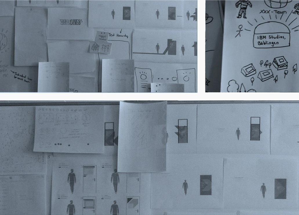
First sketches
We explored a scalable concept that reflects the lab culture inspired by the user insights
We aimed to develop a concept that can be scaled to simplify communication of room locations and essential information.
Our explorations included various themes, such as Space and Forest, inspired by the lab's culture and the associations people shared during interviews.
Prioritizing Big ideas
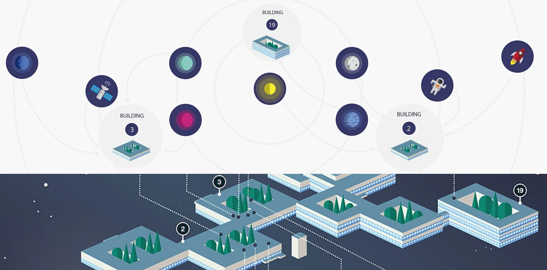
Space concept: A solar system-inspired icon design for unified room representation
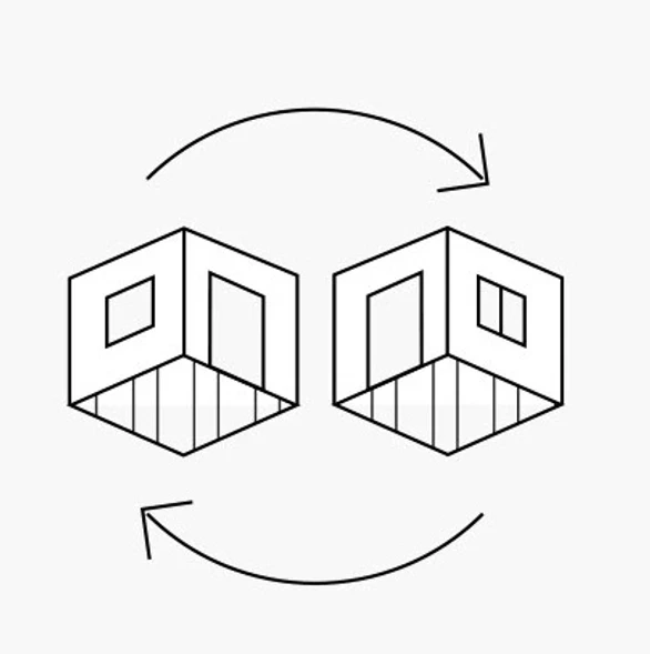
We designed an icon system to represent the rooms spread across three buildings. The main studio, an open space where all teams collaborate, was symbolized by a sun icon.
The icon system follows the logic of a solar system, with the sun (main studio) at the center and other team rooms orbiting around it. This concept not only provides strong visual associations but also allows each group and room to express individuality while maintaining a cohesive, unified design.
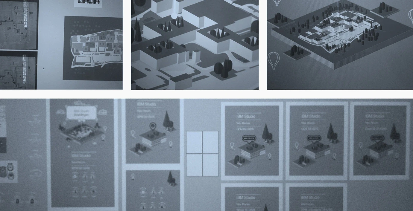
Mapping the Studio areas
I mapped the studio area starting from the original 2D planing and turned it into a 3D overview, using an axonometric approach in Adobe Illustrator.
Afterwards, I explored different compositions & illustration approaches that would fit into the Space & Forrest concepts.
Ultimately, I created the floating spaceship-like areas for the buildings within a universe-like background, to fit our Space chosen concept.
To-Be Scenario
These findings and observations were also used to reveal the content of the mobile application.
The opportunities make sure that the wayfinding and information app is built around the needs of the people in the lab.

Tom
The Designer
...can easily discover reliable information about the Design Spaces.

Greg
The Engineer
...can locate his team easier even when they move spaces..

Annie
The Visitor
...can get around the Design Studio by herself & have a clearer overview of the Research & Development lab.
Information architecture
I shapped the navigation and Space Labelling through the Interview Insights & Research
From the user needs of the three personas and the user interviews, the navigation content of the app started to have a more clear form. Also, the information content for labeling the studio spaces around the lab has now taken better shape.

Based on the prioritized content, I was able to form a better idea of how the user would move through the app and main navigation areas.
From the user needs of the three personas and the user interviews, the navigation content of the app started to have a more clear form. Also, the information content for labeling the studio spaces around the lab has now taken better shape.
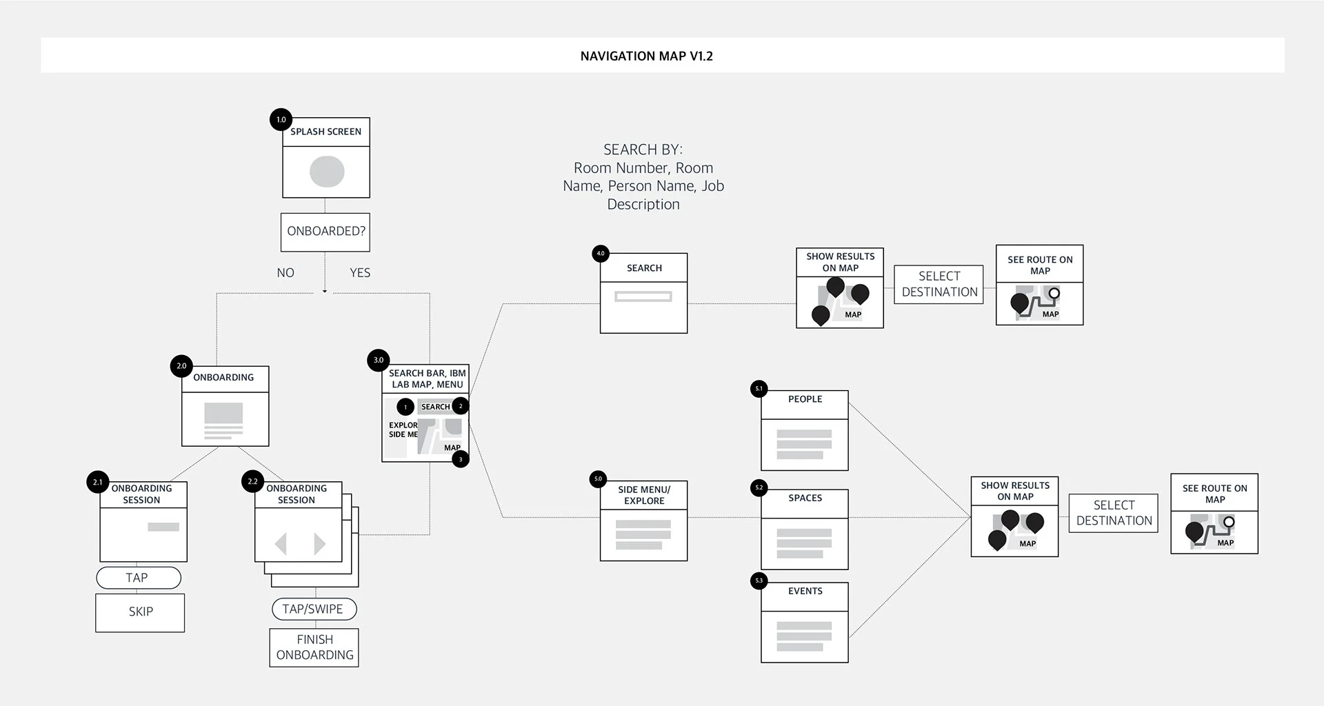
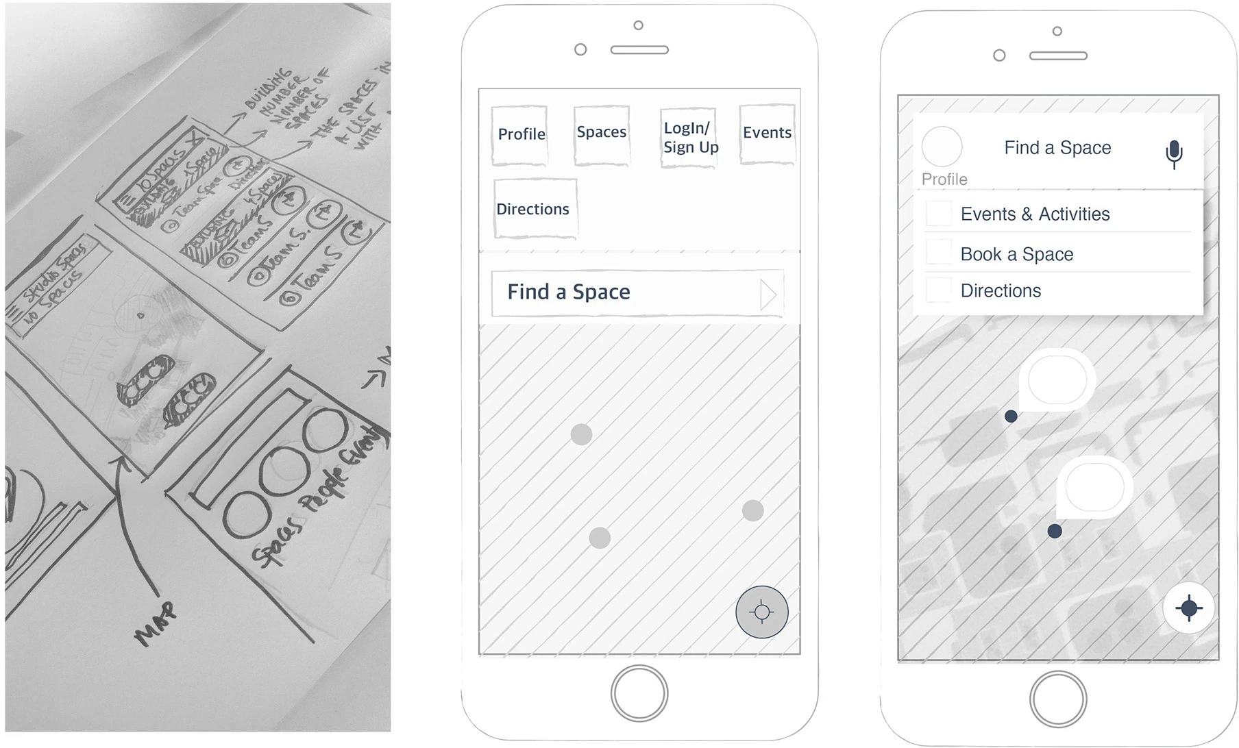
I explored initial sketches for Navigation and Task Flows within key screens in lower fidelity
Early sketches and explorations of the main navigation areas and tasks, such as finding a working space.
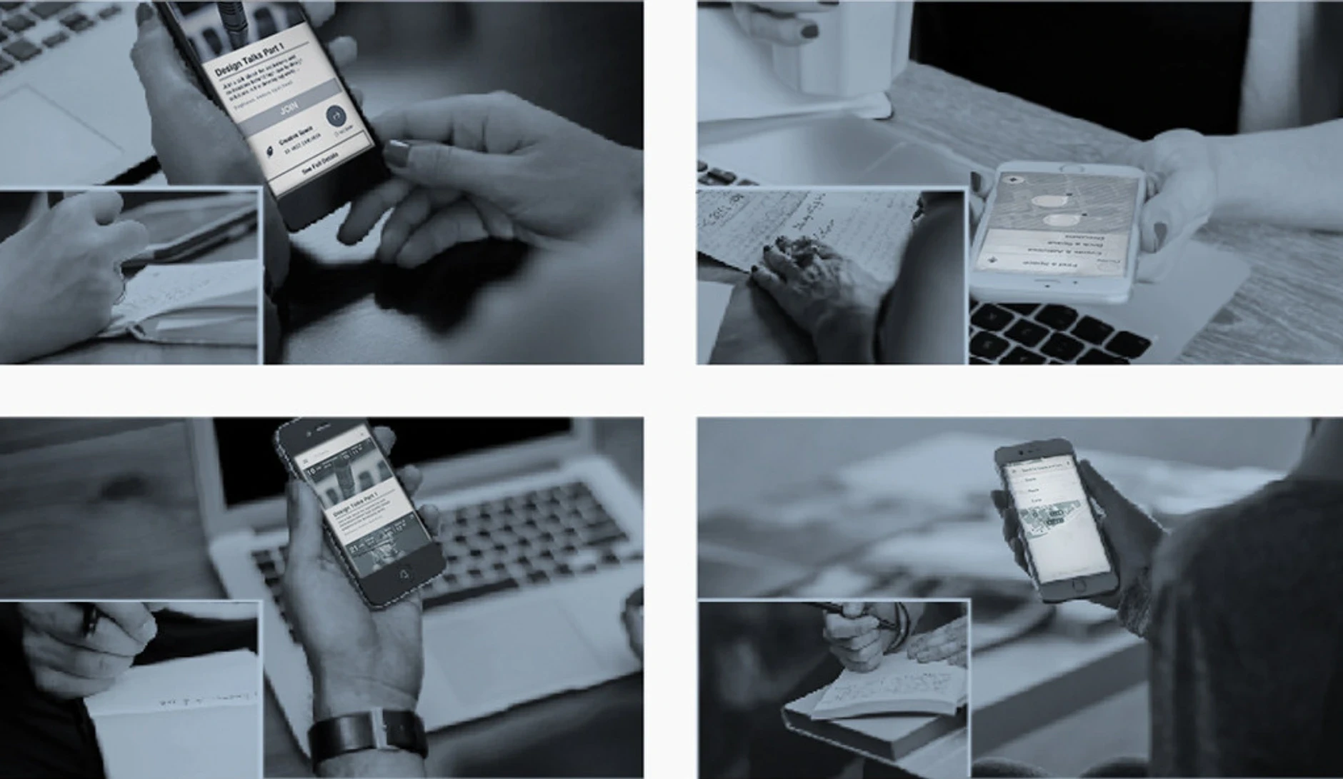
User testing
I conducted user testing with six navigation app users on InVision to gather feedback and validate the high-fidelity prototype for locating workspaces.
I asked 6 people from my friend network for feedback, who were familiar with navigation apps, and presented them with the scenarios of needing to locate a (named) working space. I used InVision and moderated user testing.
I gathered quick feedback from testing the high fidelity prototype and validated based on key insights:
#1
#2
#3
Final designs & prototypes
The installed wall panel and labels at the IBM Studio entrance, provided lab users and visitors with a clearer overview of workspaces and activities.


Learnings & What I would do differently
Expanded User Testing
Architectural mapping software
Post-implementation Feedback
More focus on budget constraints
ARCHIVED PROJECTS

Architecture
High school senior year • Candidate at the University of Architecture / Architecture trainee • Architecture & Visual Design skills